The post Sergio Jiménez: Pandemic was the moment of truth for governments’ digitization appeared first on Piwik PRO.
]]>Sergio Jiménez: Current citizens are the fruit of a 30 or 40 year-long process. We can’t understand them without a reference to the early 80s and managerial revolution developed by liberal conservative governments, which has spread as a new paradigm.
In the previous period (1950-1970, more or less), the citizen had been viewed as a consumer who should be satisfied in two key dimensions: economy (cheaper public service for a taxpayer) and quality (as individuals happy with the individual outcome). This is, I think, a non-negotiable focus for almost all governments and electors in democratic systems, at least as a concept. The problem is the definition of the length and depth of government (who and how should be covered, who are the main targets of public services), but not as a philosophy.
After this, in the 90s and the first years of 2000, we had a new wave of transformation asking for a larger participation in defining the policies and services but without renouncing the previous aspirations. In this context, the rise of the Internet has been the perfect answer to all these questions: much more information, bidirectional communication, and economies of scale to improve services.
Finally (well, not finally, but up to this point), after the 2008 crisis and with the GAFA companies and data economies treated as a new paradigm, government is a target of a new set of demands: innovation, prediction and certitude in decision-making. If Google or Amazon can suggest to us what to read or buy, how couldn’t governments answer to the needs of their citizens similarly?
Obviously, these are big concepts, and government is a large ship. It’s sturdy and hard to sink, but slow enough to make big changes. We can say that most people consider their governments as not efficient and their services as not satisfying enough. There is no great transparency and participation. Innovation is some kind of sci-fi stuff or, at best, aimed at military and national security. But if we take a look at what citizens were receiving at the beginning of those eras and what they are getting now, the changes are large and relevant. This doesn’t mean we should be satisfied. As the market changes by innovation and new products, government and public services change by citizens’ demands.
We can say that most people consider their governments as not efficient and their services as not satisfying enough. There is no great transparency and participation.
– Sergio Jiménez
Maciej Zawadziński: Public sector officials have talked about “digitization” for some time now. How would you describe the current state of public sector digitization? Have some significant steps been made? Or are we still at the beginning of the journey? What are the areas that the public sector is focusing on?
Sergio Jiménez: Well, there are several approaches to digitization, depending on the political and institutional context of each country or region. We have some countries (mostly Anglo-Saxons) with a focus on common law and a more market-focused public service aimed at the final service and a customer. On the other hand, countries of public law and large public sectors such as Spain or France have to work hard in the legal area and implement a very important series of structural changes.
There are, of course, some common areas. For example, websites are important interface for citizenship everywhere, especially for businesses and enterprises that want to make their administrative transactions. This involves digital records and some kind of digital identity (again, we are working with a very large variation of values and political cultures) with different grades of completion and integration.
In any case, I think there is a more common approach when we talk about business and economy. We’re either talking about red tape for business, or we talk about public procurement as a way to consolidate a more dynamic market, especially in the EU.
Maciej Zawadziński: There’s this LinkedIn joke that pandemic lockdowns were the biggest force speeding up the process of digitization of all sorts of businesses. Does the same apply to the public sector? In which ways has the pandemic boosted public sector migration into the digital space?
Sergio Jiménez: Yes, we can see the pandemic as the moment of truth for governments. Those who have worked somehow in this area, have adapted with the resources they had. There are governments who have worked a lot with technology and innovation and have created great and interesting projects to inform and manage the world in lockdown. Some other countries who have worked in human capital or infrastructure have pivoted in those areas.
So we have, in the best scenario, organizations with a particular approach, more or less developed. But this was a full-length crisis, therefore, we cannot answer with a partial response. Those who had state-of-the-art end services, have had to work toward integration and full back-office transactions. The ones who had created large infrastructures for record management, had to create spaces for interaction with a large capacity to answer demand peaks. And all of them, without almost any exception, had to change to telework, which was not a standard procedure for most of the countries.
So, I think most of the countries have been “fine”, considering the magnitude of the change and the catastrophic context of the pandemic. This doesn’t mean it was good enough, that’s up to the citizens to answer. But it could be really worse for almost every instance in the government and public sector.
Anyway, I would keep two or three main insights. First, we can have our preferences to deal with changes, but at the end of the day, we need to touch all the key areas to get the job done, and the pandemic has shown us this. No matter if you have been working in the back-office for years, eventually you’ll need to touch the front office, integration, identity, and all the other aspects, and governments, somehow procrastinate with large changes.
Second, large changes are just possible with the implication, dedication and good will of everyone. In this case, solidarity and engagement made it all possible. I think that, for the future, any digitization project should involve hard work to get this kind of collaboration to achieve their goals.
And finally, this is maybe the less optimistic one – the pandemic is a very specific circumstance, as we have seen in many large corporations that rely on telework. What we had before (partially developed governments, no telework structure) are not accidents but a result of a concrete philosophy which is likely to remain the same after the crisis. If you see which companies (or countries) are going back to the office or in-person services, you will see they had a similar pattern before 2020. On the other hand, the ones who had, at least, some work done for these areas, are likely to keep the changes after the pandemic. This means, accidents (even huge ones) can change a little, but not the destiny, which is the fruit of will and philosophy. These can change, obviously, the world won’t be the same for us. But it will take time and the development of new ideas to link this new context with the previous beliefs and principles of the system.
There are governments who have worked a lot with technology and innovation and have created great and interesting projects to inform and manage the world in lockdown.
– Sergio Jimenez
Maciej Zawadziński: Data is important for every organization building an online presence. Where is the public sector at with the adoption of online experience measurement and other data technologies?
Sergio Jiménez: As I said before, it depends a lot on the culture and philosophy of each country. For example, the US or Great Britain, among others, are working very hard on getting a state-of-the-art model of digital service. This means specialized teams and a lot of data analysis, A-B testing, user surveys and ad-hoc studies. These have also worked in common frameworks of design (at federal-central level) which could allow getting common insights and improvements for the whole system.
On the other hand, the countries with a continental approach are struggling a bit with this question. This is not really different to the other services (in-person or telephonic ones) where there is also no culture of measurement or improvement and user-centric analysis. In this case, I think, the use of data is really more related with the workload, cost of transaction and savings. More economic approach is hard to distinguish for the user as the citizen.
I have a little optimism, because the technologies are there. They’re not used because of the notion of citizens as a passive part of the public service, rather than its real center. But, in any case, there are more voices and interest and I guess with a little more time, we should be watching some kind of changes, at least, in some areas or clusters (for example, healthcare or economic subsidies).
Maciej Zawadziński: One of our clients, the Government of the Netherlands, successfully uses analytics data to optimize the content of their website. Can you share some other examples of public sector successes in the digital space?
Sergio Jiménez: I really like the approach of the US federal government, with two different actors: US Digital Service, and 18 F. They are working with different approaches and areas, but getting great results with the UX. Also, they are sharing a hub of data from web analytics, very helpful to understand how people are using services and which is really useful to get ideas to improve.
Also, the Government Digital Service from the UK is doing a constant job, using information of digital use and the value of the services. I think they have a very interesting focus and ideas. Denmark has also created a single portal architecture based on a simple identification system, which I personally like a lot.
There are plenty of good services, also in the local government, all around the world. But it’s always hard to distinguish what is good and what we do like as design and concept. This doesn’t mean they are working at all, because, as I have said, not all political cultures tolerate or expect the same.
A really successful service in Canada could maybe not work at all in France and vice versa. That’s why every government and public organization should try to discover by themselves if what they think their users like is what they really do want.

Web analytics for governments
Part 1: The framework for setting the right KPIs
Part 2: How to work with strategic & tactical goals
Part 3: Working with operational KPIs
Sergio Jimenez is a consultant specialized in helping public administrations in their path to digital transformation. To get there, he studied political science at the Institute of Political Studies of Paris, and at the University Complutense of Madrid, where he got his PhD with a dissertation about digital outcomes in bureaucratic infrastructures. He also worked as a software designer for public administrations and as a project manager for a technological consulting firm.
In 2013, he received the Achievement Award in Web Intelligence from the University of British Columbia and the University of California, Irvine. He launched the blog Analitica Pública, where he aims to analyze, explain and divulge practices for creating value for citizens. He looks at all kinds of governments and administrations. It has become one of the most influential Spanish-language blogs about analytics in the public sector.
After that, he began to work as a consultant with various administrations at the national, regional and local levels. He was involved in projects touching on numerous topics, such as website design, transparency, methodology frameworks, and digital analytics. He is also a professor at Universitat Oberta de Catalunya, University Complutense and National Institute of Public Administration (INAP). Recently he got certified as a data analyst at the University of Toronto.
He is the author of Does my public administration’s website work? Guide to digital analytics for public administrations, and Digital transformation for public administrations: creating value for citizenship in the XXIst century, both edited by INAP.
The post Sergio Jiménez: Pandemic was the moment of truth for governments’ digitization appeared first on Piwik PRO.
]]>The post Fleur Boesenkool & Niels Dekker: Great public sector websites give visitors a peace of mind appeared first on Piwik PRO.
]]>Niels Dekker: What I like about public sector websites is that they give the visitor peace of mind. I always advise to embrace this feeling when optimizing a website. Commercial organizations have different missions to accomplish. They are often forced to push their visitors along the conversion funnel and design their sites with that goal in mind.
Maciej Zawadziński: Commercial brands are all about optimizing their websites to get better conversions and revenue. Is the pursuit of optimization as strong in the public sector?
Fleur Boesenkool: The public sector content managers and communication advisors we meet are very involved with their content. They definitely feel the need to make it better. In general, I think that the public sector is highly interested in optimizations based on analytics data. We’re talking to several parties who are applying this approach in their work, or are exploring the possibilities.
That said, the public sector is still at the start of its journey with data-driven methods.
The public sector content managers and communication advisors we meet are very involved with their content. They definitely feel the need to make it better.
– Fleur Boesenkool
Maciej Zawadziński: Content writers, communication advisors, managers from different departments – there are many stakeholders interested in analytics data in a public sector organization. What does each party want to achieve with analytics data?
Niels Dekker: Content writers, communication advisors and webmasters are looking for the right tools to improve their work. They want to know if the changes they make match the goals of visitors (or target group). They want to see proof that they’re getting it right.
Management is more about maintaining control. They ask questions like: Are we doing the right things with our resources and budget? They are also more focused on trends and predicting the outcomes.
Maciej Zawadziński: As the public sector is at the beginning of its journey with data, there’s probably a lot of fear involved. What are the typical worries and objections of the public sector going into analytics?
Fleur Boesenkool: I wouldn’t call it necessarily “fear”. It’s rather a lack of awareness of how data can improve their work. They’re not data analysts and are not intrinsically triggered by numbers.
If you just drop a cool tool, it won’t work. There’s a profound need for the onboarding and adoption stage, during which public sector partners learn how to use data in their day-to-day work. At the beginning, we especially like to help create “small successes” for our partners – small adjustments that give good results in their daily work. When our partner is curious and likes to tinker, that helps as well. And simple data visualizations are helpful too.

Maciej Zawadziński: As you’ve said, data-driven culture in the public sector is in a very early stage. How do you approach complex tasks and get on the same level as with the commercial clients?
Niels Dekker: That can be accomplished by having a good dialogue with the end users. We always start by having a simple meeting with content writers, present the data for one of their pages and discuss its meaning in a very practical way. Our experience is that the creators can have quite an advanced take on the pages they write and the meaning of the presented data. We help them find what users’ actions stand behind the data and what they can do to improve these statistics.
Maciej Zawadziński: Here’s where Toon Vuursteen’s FTG analytics framework for the public sector comes into play. Toon is a Dutch thought leader in digital analytics for the public sector. Based on his recommendation, you’ve created a special dashboard for the public sector to track their success online. Why have you decided to work with Toon’s framework? What were your motivations here?
Niels Dekker: We certainly see a difference between the online presence of commercial organizations and the public sector. Much of the available frameworks were crafted for commercial companies, so it’s hard to use them in public organizations. The public sector’s online goals are less defined, so the structure of the FTG framework, designed with the public sector in mind, has great value right from the start.
Based on Toon’s ideas, we have built an analytics dashboard to make data more approachable for different people within the municipality. They are way broader than dashboards grounded in analytics alone. By presenting the data in a structured and goal-oriented way, they become much easier to interpret and act on.
Fleur Boesenkool: Municipalities want to be more data-driven. To reach this goal, the data they use has to be made accessible to anyone within the organization who needs it. A framework like the FTG-model translates the overwhelming output of an analytical system into a focused format based on the creator’s practical needs.
We certainly see a difference between the online presence of commercial organizations and the public sector. Much of the available frameworks were crafted for commercial companies, so it’s hard to use them in public organizations.
– Niels Dekker
Maciej Zawadziński: Has the FTG framework dashboards been deployed already? What do public sector customers think about it?
Fleur Boesenkool: Multiple customers use, or are in the process of developing, an FTG dashboard for their communications department. We are working with analysts, content creators and communication advisors to introduce more of them.
Niels Dekker: So far, we have built two dashboards based on the FTG framework for two major capitals in the Netherlands. The dashboards are used by content writers in cooperation with the facilitating departments. The reactions are great, the figures are easy to understand and give a useful perspective on the data.
Maciej Zawadziński: With this initial success, what are you planning to do next? What direction will the FTG dashboard project take?
Fleur Boesenkool: During the development of various dashboards, we noticed content creators and communication advisors alike are interested in the higher levels of the framework, meaning the citizen’s online journey. Different page types, linked in a specific order, create a task. Higher levels of the FTG framework make it possible to score the usability of the website based on various tasks that can be accomplished by visitors.
Niels Dekker: We have started with the lowest level of the FTG framework, the page level. This has given insights on how different pages influence overall website performance. The use of the page-level dashboard has also created the desire for better defined citizen online journeys, which will be the next step in our development process.

You might also like:
How the Government of the Netherlands uses Piwik PRO to better inform their citizens [success story]
Fleur Boesenkool – data analyst at Swink, since 2016
Fleur is involved in data analysis with a focus on web data. She retrieves detailed user data with tools such as Piwik PRO and Tag Manager to map the surfing behavior of website visitors. She also creates dashboards in Power BI for Swink’s customers. With this, she makes connections across different data sources (such as user behavior on their website, their social media platforms and newsletters) and visualizes them.
Niels Dekker – data analyst at Swink, since 2018
Niels performs data analysis. As organizations often have different data flows, his job is to present them in the best possible way on a dashboard. This allows his clients to have all the information at a glance, but also gives them the opportunity to dig deeper if the data raises questions. This way, they can quickly make the right decisions, such as which goals they want to achieve with their organization.
The post Fleur Boesenkool & Niels Dekker: Great public sector websites give visitors a peace of mind appeared first on Piwik PRO.
]]>The post Toon Vuursteen: Citizens are used to a smooth digital interaction with commercial companies and they expect the same from their government appeared first on Piwik PRO.
]]>Toon Vuursteen: I always advise public institutions not to take the private sector as an example too much. Of course, there are some things to be learned from them. Commercial companies are more experienced in conversion rate optimization and A/B testing than most government institutions. Also, knowledge about the psychology behind online persuasion is more widespread in the private sector. For example, the use of Cialdini’s 7 persuasion principles. And of course there is much more knowledge about digital marketing and audience targeting.
But the digital information and service channels of a government organization are really something different from an ecommerce website. Comparing them isn’t always useful, and in some cases is even harmful. Sometimes I see organizations in the public sector trying to benchmark metrics like their conversion rate against the conversion rates of commercial websites. This doesn’t make any sense.
The conversion rate for applying for a new driver’s license can’t be compared to buying jeans in a web shop. Even the worst web form shows a high conversion rate if it serves to apply for a driver’s license. People can’t go without a license, so they will struggle through the most awful web form. Also, government websites are much more about informing citizens on a wide variety of subjects. A successful visit is when the citizen can find the information quickly and the information is correct, complete and easily understood. Also, the information should be accessible for people who are visually impared or have other limitations in using websites.
Digital information and service channels of a government organization are really something different from an ecommerce website. Comparing them isn’t always useful, and in some cases is even harmful.
– Toon Vuursteen
Maciej Zawadziński: Let’s talk about the big picture. Companies use the internet as a customer acquisition channel for their products and services. What would be the public sector’s “ultimate” reason for an online presence?
Toon Vuursteen: The online presence is all about making it possible for the citizen to do business with the government in a modern, easy way. Citizens are used to a smooth digital interaction with commercial companies, and they expect the same from their government. At the same time, governments – just like companies – try to save money. Online transactions are less expensive than transactions by phone or at the service counter in the municipality hall. There are many standard transactions that can be done online. This leaves more time and money for public servants to address the more complex custom transactions. In the end, it’s all about serving the citizen as well as possible within the limits of budgetary and time constraints.
Also, reputation management is an interesting field for governmental organizations. The Dutch court system, for example, puts a lot of effort in providing objective and important news articles about important lawsuits that are going on. They also communicate a lot about how judging in court works, for example, explaining why sentences are less harsh than the average citizen would expect in some cases. In general, most government agencies are only present in the media when something goes wrong. So they themselves need to tell us what’s going well. They need to defend their reputation.
Maciej Zawadziński: Companies tend to continually optimize their online channels to increase sales. What about the public sector? What are the things that public institutions can refine, and what would the expected outcomes be?
Web analytics for governments
Part 1: The framework for setting the right KPIs
Part 2: How to work with strategic & tactical goals
Part 3: Working with operational KPIs
Toon Vuursteen: Public institutions need to refine the ease of use of their digital channels. We all know the theory of “top tasks” developed by Gerry McGovern. Most citizens use the digital channel of a government agency for just a handful of tasks. These tasks should be as easy as possible.
Optimizing the whole website is impossible for a government agency, but make sure that the top tasks of your citizens are optimized as much as possible. Spend 80% of the money and time of your online team on optimizing these top tasks. I know that’s hard. Legislation requires agencies to facilitate hundreds of tasks and deliver information about many subjects that only a few people ever need. But try to focus on the stuff that is important for the average citizen. Make those into the most easy and happy customer journeys imaginable.
This is happening more and more in the public sector. User-centered design, design thinking, focus groups, citizen participation is emerging really fast in the public sector. Last week I even read about an experiment in which a government app was designed by citizens. The designers of the government agency facilitated the session and only afterwards shared their opinions with the citizens. The initial design was completely done by the citizens themselves. The outcomes were radically different from what the designers would have come up with. Of course, the citizens weren’t UX or service designers, so they made some “design mistakes”. But the solution they came up with was not restricted by the ways of thinking and procedures of the government agency. They came up with a solution that could only be created by citizens themselves.
Maciej Zawadziński: Analytics data is the cornerstone of online presence optimization. How would you describe the current state of public institutions’ adoption of online analytics? What data do they collect and how do they work with it?
Toon Vuursteen: The current status of digital analytics in the public sector makes me cry. Most people working on governments’ digital channels are absolutely not data-minded. Data is scary, Excel is scary, numbers are scary. Also, measuring is much less important than in the private sector. You don’t spend millions of euros on digital advertising that needs to be monitored closely because every single euro has to be earned back.
In the old days, I worked as a digital analyst in the private sector. My job resembled the job of a stock exchange broker. Each keyword advertised on, each banner we put on the internet, each YouTube clip, was measured. We measured reach, engagement, click-through rates, conversions. All revenue and ROI were closely monitored and optimized. It’s a bare necessity for running a healthy business. Although many online teams in the public sector feel the obligation to serve citizens as well as possible, it’s not a game of life and death like it is in the private sector.
One more reason for not using the full potential of online analytics is that most analytics tools are designed for the private sector. They contain many standard reports about CPC, CPO, conversion, ROAS, ROI etc. etc. All very vital for ecommerce but pretty useless for the public sector.
Maciej Zawadziński: You’re the author of the FTG Framework for the public sector. Why did you decide to create those guidelines? How can it boost the public sector’s online presence?
Toon Vuursteen: That’s caused by what I just said about analytics tools not being very useful for government agencies. Which ad group delivers the most revenue isn’t very useful because… well, there is no revenue [laughs].
Public institutions want to measure the effectiveness of their online channels with very different metrics. Because, as I mentioned before, the aim of governments is to serve and inform citizens as well as possible. They need different kinds of metrics like ease of use, task speed, accessibility, task completion rate. In the end, they also need strategic KPIs such as reputation score, rate of reducing operational cost, content comprehensibility rate etc.
These metrics are not present in Google Analytics or Piwik PRO. So I developed a layer on top of those platforms that delivers metrics which are more useful for governmental use. This layer is called the FTG framework. I’ve written a bunch of articles about it. Three of them are on the Piwik PRO website, by the way. Those three I consider the best because I wrote them together with Karolina Lubowicka. Actually, I just talked and she did all the writing. That’s why the articles are so good [laughs].
Maciej Zawadziński: There’s a lot the public sector can learn from the private sector. How about the other way around? Is there something that the public sector does better and companies can adopt to refine their own online activities?
Toon Vuursteen: Yes, sure. First and foremost, developing accessible websites and apps! Most websites in the private sector are really not accessible for the visually impaired.
Also, most web teams in government organizations are starting to be very good at comprehensible writing. I encounter more and more texts on government websites that are easier to understand than texts on e-commerce websites. This used to be the other way around. Government websites were full of terrible public servant lingo. That is no longer the case.
Last but not least, privacy is much more top of mind with government organizations and they put more effort in making sure the privacy of website visitors is guaranteed. That’s why the Dutch government uses Piwik PRO Analytics, while most commercial companies still use Google Analytics.
The aim of governments is to serve and inform citizens as well as possible. They need different kinds of metrics like ease of use, task speed, accessibility, task completion rate.
– Toon Vuursteen
Toon Vuursteen is a Dutch thought leader in digital analytics for the public sector and the author of the FTG (Functie-Taak-Gedrag) framework. He has advised many public service institutions, including the municipalities of Amsterdam and The Hague (Den Haag), the Dutch court system (Rechtspraak) and ministries, departments and agencies of the Dutch central government (Rijksoverheid).
The post Toon Vuursteen: Citizens are used to a smooth digital interaction with commercial companies and they expect the same from their government appeared first on Piwik PRO.
]]>The post Web analytics for governments part 3: Working with operational KPIs appeared first on Piwik PRO.
]]>From this series you’ll learn how public institutions can use this model to:
- Replace intricate reports with intuitive and user-friendly dashboards
- Limit their data collection to what’s essential for their goals
- Easily spot areas of their websites that require improvement to prioritize changes and provide better services and access to public information
- Stay aligned with the highest privacy standards thanks to a safe analytics platform (Piwik PRO)
In previous articles we walked you through the principles of the FTG framework. We also presented real-life applications of the model, starting from the level of strategic and tactical goals.
We encourage you to explore the other parts of the series before reading this one:
We encourage you to explore the other parts of the series before reading this one:
Today we’d like to wrap up the series by showing you how to work with dashboards related to operational goals for your website.

Operational KPIs – a short introduction
The KPIs at operational level measure the performance of individual pages grouped into page categories, such as:
- Recipients
- Navigators
- Informers
- Explainers
- Closers
- Converters
Although single pages may seem small and unimportant, the opposite is in fact true. Why?
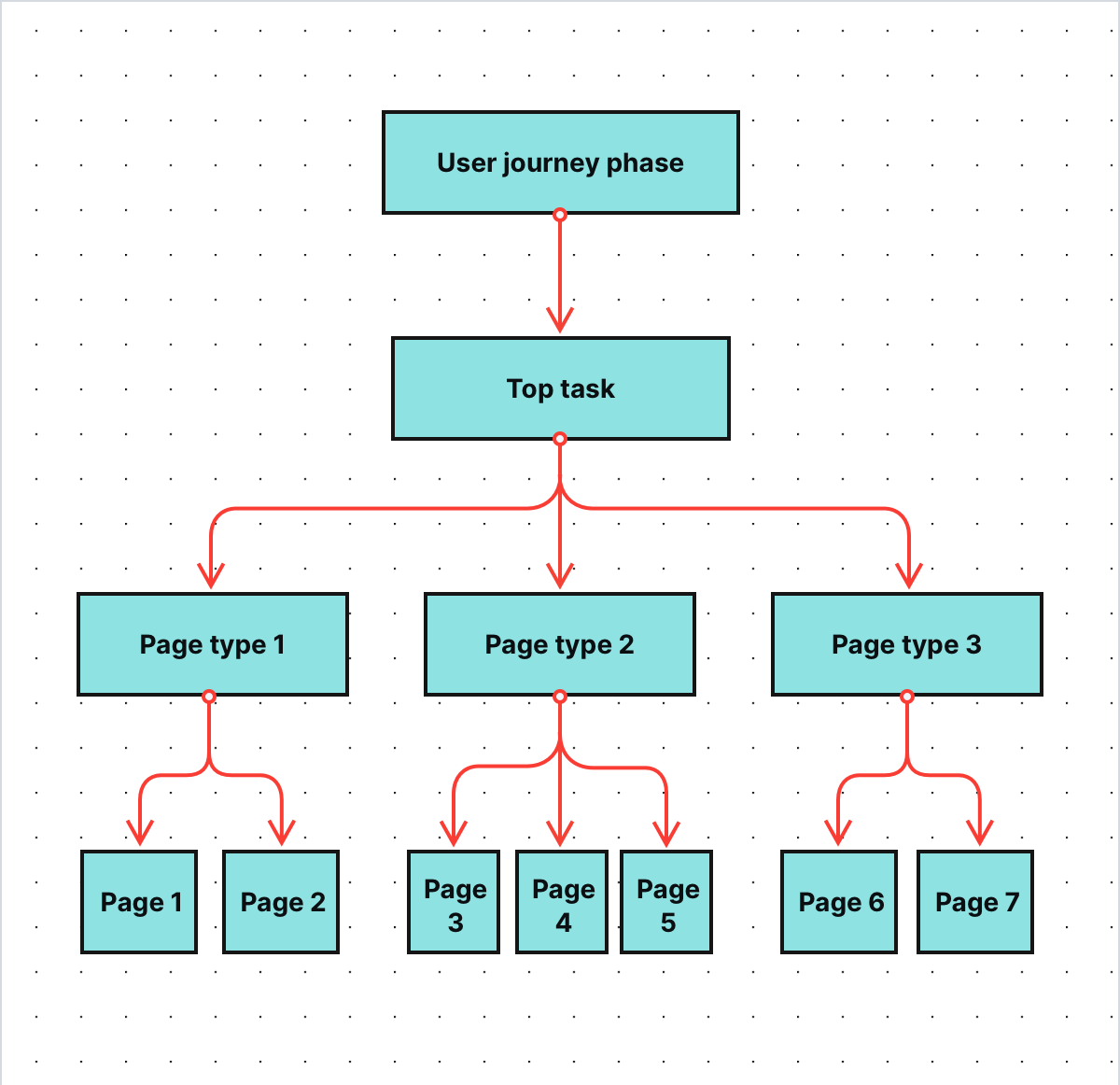
Pages are the building blocks of a website and have tremendous impact on its overall performance. Their statistics also influence the higher levels of the FTG framework – the levels that concern user journey phases, tasks and strategic KPIs.
COMPARISON
The comparison of 10 web and app analytics platforms
Learn the key differences between Piwik PRO Enterprise, Google Analytics 4, Matomo Cloud, Adobe Analytics, AT Internet, Countly Enterprise, Mixpanel Enterprise, Amplitude Enterprise, Snowplow Enterprise, and Heap Premier.
Single digital gateway integration (SDG) for government organizations
Single digital gateway integration (SDG) for government organizations
Transfer all the necessary information to the single digital getaway automatically to easily comply with EU regulations. Use the integration to send the Piwik PRO monthly report to SDG. The report includes information on page views by country and device for each URL. The integration is available upon request to all our users. Read more on SDG integration.
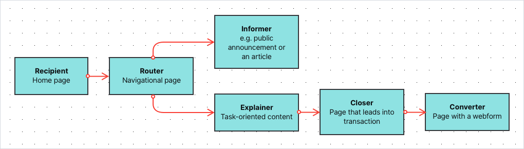
Types of pages on government websites
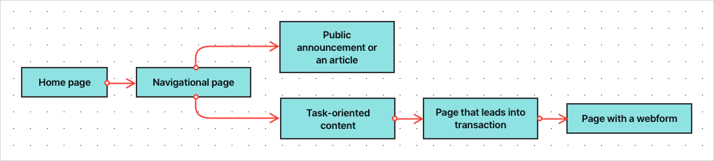
According to Toon Vuursteen’s model, you can divide pages on public service websites into the following categories:
- Recipients – The general homepage and start pages of other sections of the website, e.g. specific services or departments. Their goal is to welcome visitors, provide them with an overview of the website and direct them to the sections they’re looking for.
- Navigators/Routers – Pages with extensive menus linking to different parts of the website. These are all types of pages with a list of links to follow or options to choose from.
- Informers – Content pages that present pieces of information not related to specific tasks, e.g. articles, guides or public announcements.
- Explainers – Task-oriented content that explains specific processes and procedures related to the tasks, e.g. applying for or exchanging a parking permit.
- Closers/CTA page – Pages that lead the visitor into a transaction process, e.g. to a page where they can perform a desired task. It’s typically a page that provides further explanation and contains a call to action to the transaction (conversion) page or web form.
- Converters – The transaction process, usually a web form, where visitors can place their applications or complete other tasks. In most cases, each step in a form is treated as a separate page. This way you’re able to spot at which step people drop off while filling out the form.
Grouping pages into categories lets you assign an appropriate set of metrics and KPIs to certain pages – after all, every page type serves its own purpose and has different goals. It also allows you to understand what function a given page has in the user journey and the tasks visitors perform on your website.
How to measure the effectiveness of page types
Because each page type is different, you also use a different set of metrics to track its performance. Depending on the type of page, you can measure your progress with metrics such as:
- Page views – How many times a page has been viewed over a given time.
- Click-through rate –The proportion of visitors who clicked a navigational link on a page.
- “Oops” rate – The proportion of visitors who clicked the wrong link and went back and forth on the page in search of information. It indicates that they weren’t able to find what they were looking for.
- Menu rate – The proportion of visitors who looked for information in the top menu of the page or in the footer. It indicates that the page is not presenting the information the visitor has expected.
- Search rate – The proportion of visitors who used internal search. It indicates that the page lacks the information visitors were looking for.
- Contact rate – The proportion of visitors who visit the contact page and look for e.g. an email address or a phone number of your organization, indicating a channel switch to more expensive customer channels.
- Bounce rate – The proportion of visitors who landed at the page coming from outside the website and ended their visit immediately.
- Exit rate – The proportion of visitors who explored the website for a while, then arrived at a given page and decided to leave.
- Scroll depth – How far visitors looked down the page when browsing it.
- Time on page – How long the visitor stays on the page.
- Extra time needed – How much extra time (%) a visitor needs compared to the fastest visitor.
- Entry rate from SEO – How many visitors (%) have entered the site through search results.
- Entry rate from social media – How many visitors (%) have entered the site through social media channels.
- Entry rate from news apps – How many visitors (%) have entered the site through news applications such as Google News and the apps of newspapers.
- Successive page consumption – The scroll depth of the page a user visited next.
- Subsequent conversion – The percentage of users who have visited a closer page and converted, e.g. filled in a form.
- End conversion rate – The conversion rate of the web form related to a certain task, e.g. applying for a ticket permit.
The collection of metrics will vary depending on the page’s category. Here’s a table explaining which metrics are important for each page type:
| Metric | Recipients | Routers | Informers | Explainers | Closers | Converters |
|---|---|---|---|---|---|---|
| Page views | ||||||
| CTR | ||||||
| Oops rate | ||||||
| Menu rate | ||||||
| Search rate | ||||||
| Contact rate | ||||||
| Bounce rate | ||||||
| Exit rate | ||||||
| Scroll depth | ||||||
| Entry rate from SEO | ||||||
| Entry rate from social | ||||||
| Entry rare from news apps | ||||||
| Successive page consumption | ||||||
| Subsequent conversion | ||||||
| Drop off rate | ||||||
| Time on page | ||||||
| Extra time needed | ||||||
| End conversion rate |
The metrics above are Toon’s basic suggestion. It could very well be that you decide to do things a bit differently. For example, the “Contact rate” could be measured not only at the router pages and explainer pages but also on other page types. That really depends on your website, your online goals and your creativity.
Good practices
The metrics above are all derived from web analytics data. It’s a good habit to expand the set of metrics with ones based on qualitative research and user feedback. We won’t elaborate on that in this article, but just to mention two of them:
- % of visitors who find a page useful
- A score of a page’s understandability (e.g. on a scale of 1 to 5)
Based on all metrics, Toon’s team calculates KPIs for each page type, such as:
- The overall score – how well this page is doing compared to other pages
- Growth – the progress of a given page over a certain period of time
Here you can see a sample dashboard for the navigators:
With all those metrics and KPIs in place, you can examine which pages are doing a good job and which require some improvements. You can also compare their performance to other pages that serve the same purpose.
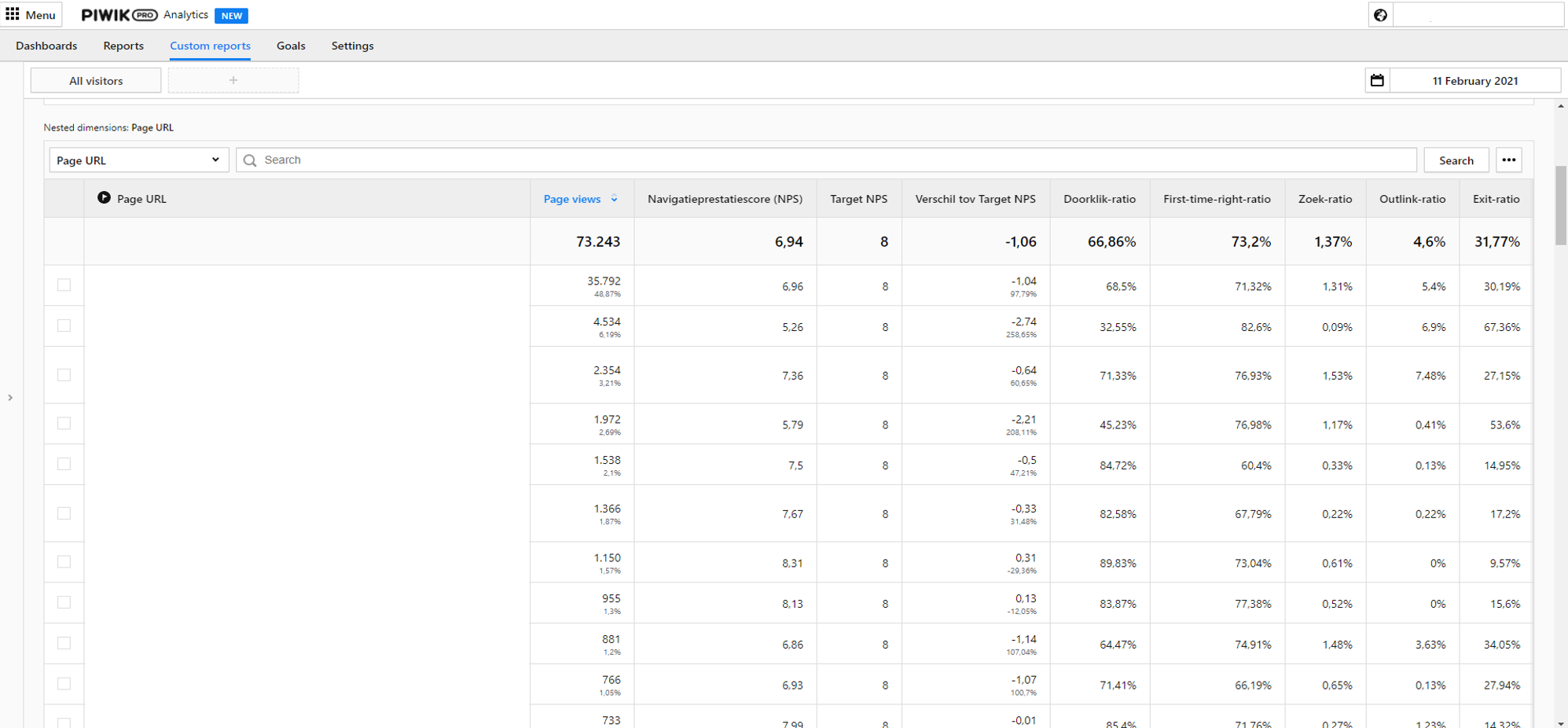
The dashboards for government institutions can be presented in a spreadsheet, in a data visualization tool or with the custom dashboards available in Piwik PRO. Here you can find a sample custom report for navigator pages:
The dashboards for government institutions can be presented in a spreadsheet, in a data visualization tool or with the custom dashboards available in Piwik PRO. Here you can find a sample custom report for navigator pages:
Working with operational KPIs – a helpful use case
Operational goals are the lowest, most granular level of the FTG framework. Typically, you get down to them after you spot problems on the dashboards concerning strategic and tactical goals. To show you how to utilize dashboards from the operational level of the FTG framework, we’ll get back to the use cases from the previous article.
pro tip
If you’d like to take a closer look at the previous part of the use case, visit this link.
To give you a short recap – in this use case, you work for one of the biggest municipalities in Western Europe. Your job is to make sure that the website of your organization is providing a stellar experience for residents. To do so, you work with the FTG framework and dashboards created by Toon’s team.
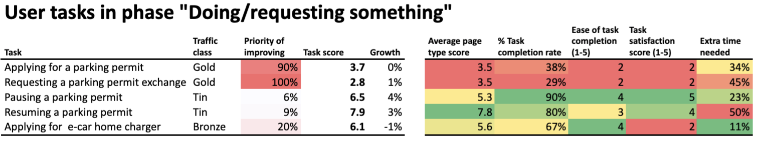
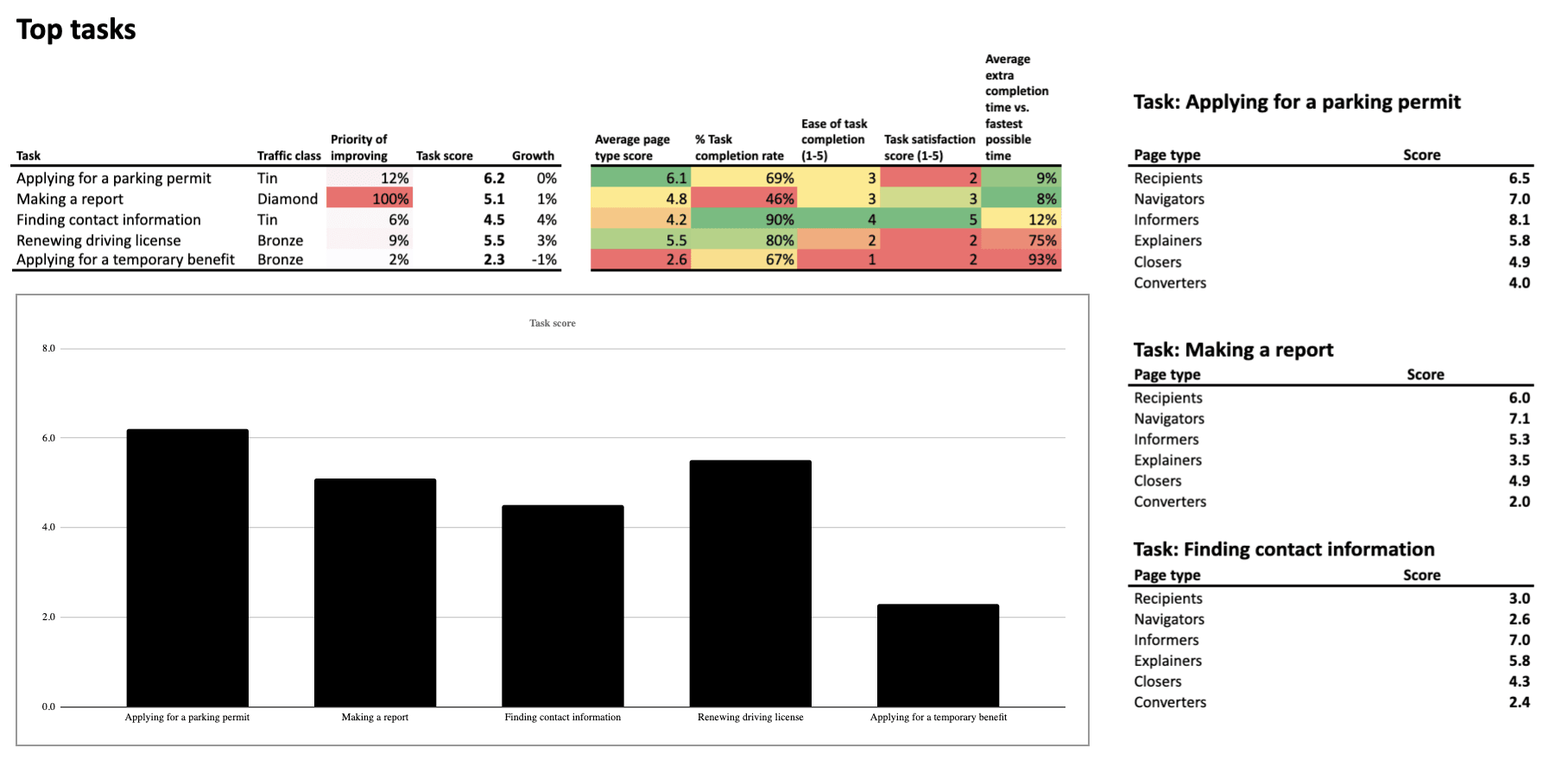
From the strategic-level dashboards you know that the score for service-related tasks is critically low, at 4.1. It means that citizens face major obstacles when trying to access your services.
So you dig deeper. On the level of tactical KPIs, the following phases are underperforming:
- Doing/requesting something
- Using product or service
At the same time, the dashboard presenting KPIs for particular user tasks suggests you should investigate tasks related to:
- Applying for a parking permit
- Requesting a permit exchange for people who have relocated to a different parking zone
You can also spot that the page types known as converters and closers are performing really poorly. But to find out what’s causing the trouble, you need to go a step further and investigate the dashboards related to operational KPIs.
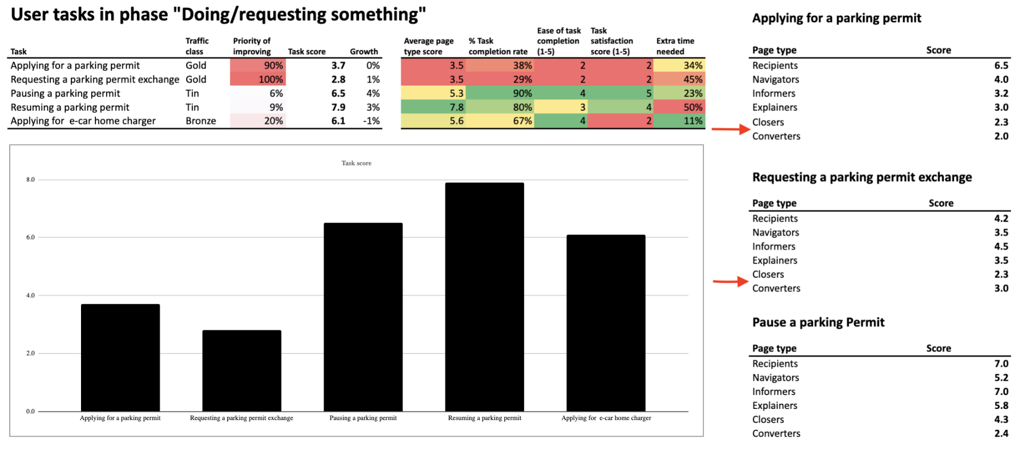
Let’s take a closer look at them.
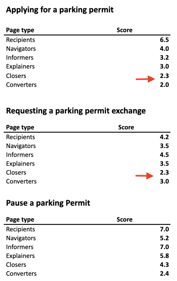
Closers
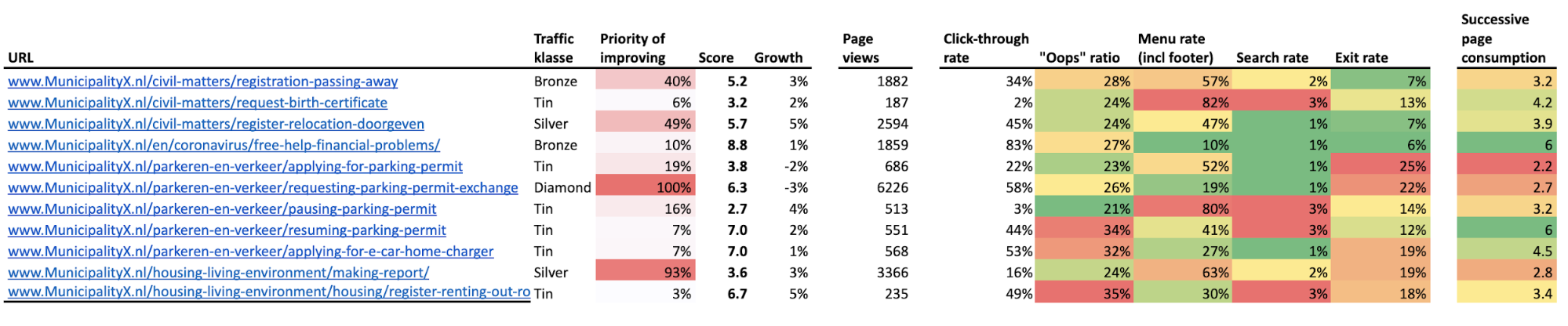
The data suggests the two most underperforming pages are the ones related to requesting a parking permit, with a low score of 3.5.
pro tip
A total page score is calculated based on every metric included in the dashboard. In the case of closers, the list includes page views, visits from Google, visits from social media, click-through rate, exit rate, extra time needed, scroll depth and subsequent conversion.
“Requesting a parking permit” page
The main cause of the low score is a click-through rate of 22%. The average visitor sees only the first 20% of the page, and 78% of them drop off. Also, the average user needs 69% of extra time (compared to the fastest user) to click on the call-to-action button. What does this tell you?
It could indicate many issues, for example:
- The call-to-action button may be placed below the fold, which makes it more difficult for visitors to find and use it. This would also explain the low click-through rate.
- The instructions on the page are hard to understand for the average resident and discourage them from taking the desired action.
Or there could be some other reasons. The FTG model points out low-performing pages but doesn’t tell you the cause. You need to investigate this issue yourself. You’ll do that by closely examining the underperforming pages of your website.
“Requesting a parking permit exchange” page
When you closely analyze the other low-performing page, the one related to requesting a parking permit exchange, you see more or less the same thing. There is one difference though: this page has also a low percent of visits from Google – 26%. This means you need to pay particular attention to e.g., keyword density or formatting of this page, to make it more attractive for search engines.
Converters
Next, let’s examine the performance of closers – the pages that are the last step in residents’ journey.
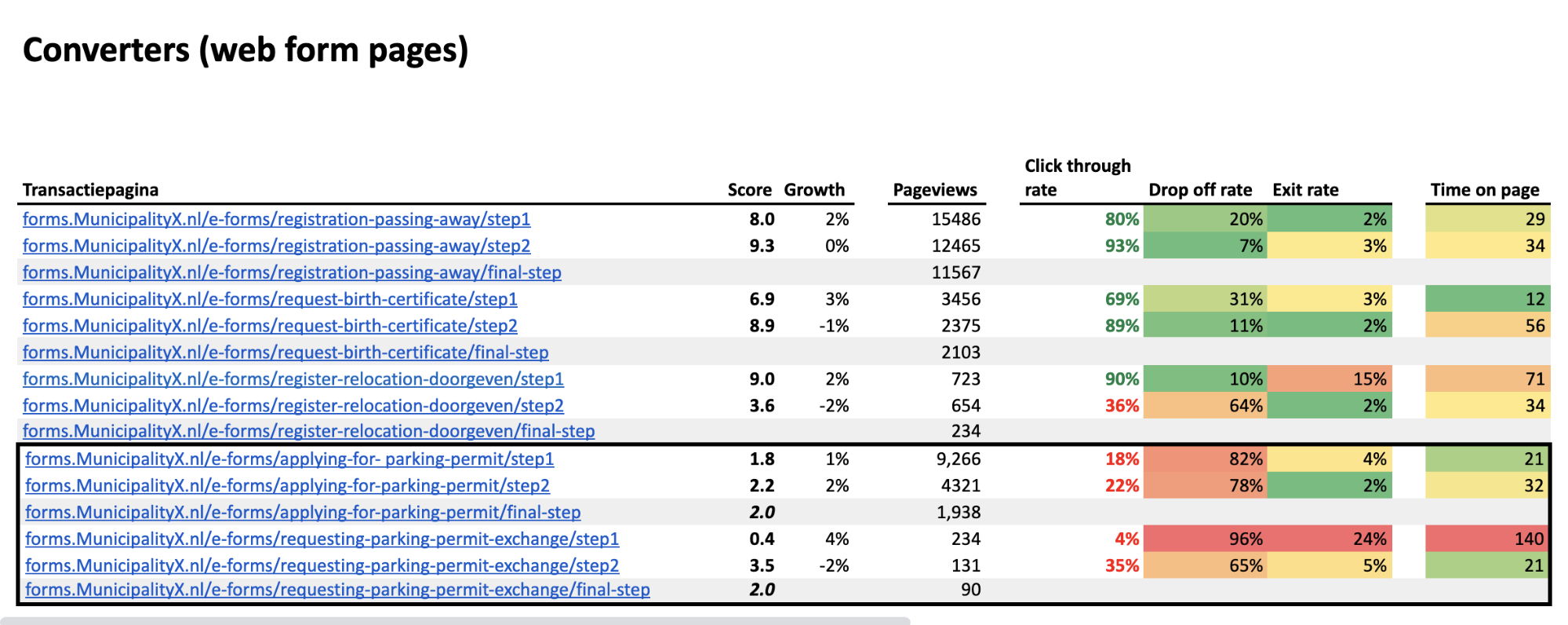
Applying for a parking permit
The dashboard shows you which pages are performing the worst. The ones related to applying for a parking permit have a low score of 2.0. This is the average score of the first (1.8) and the second step (2.2) in the web form.
The click-through rates for both steps are low – 18% between the first and second step, and 22% between the second and the third. Higher up the list, you can see much better click-through rates for different converter pages, reaching up to 93%. This makes it clear that both steps are doing poorly compared to other pages in the same category.
What may be causing these problems? It could be that:
- The introductory text is too difficult to understand
- Some functionality on this page is not working correctly – e.g., a drop-down menu or a map
There can be many reasons that explain the bad scores of particular steps in the web form. As we’ve said, the FTG model points out underperformance, but you need to perform a closer examination to test out your hypothesis.
Requesting a parking permit exchange
The other low-performing converter pages (the steps in the web form related to requesting a parking permit exchange) have the same low score of 2.0. The score of the first step is especially alarming, as it is a mere 0.4.
What’s more, in the first step you can see that many people don’t just drop out of the funnel – 24% of them leave the website completely. Finally, the average time on the page is really long in the first step compared to all steps in other web forms.
This may indicate problems such as:
- Too long or intricate instructions on how to request a parking permit exchange
- Too many fields in the form, which makes it difficult to complete
- Unclear naming of the fields in a form
- Malfunctioning of some features on the page in certain browsers (e.g., a submit button)
You need to think of all possible causes and do some further investigation. In this case, with the extremely high drop off rate of 96%, performing some user testing would be a good idea.
Summary
The FTG framework serves as a great method for detecting and examining underperforming areas of your websites, as the data is presented on user-friendly dashboards. It makes it easier to prioritize changes, since the metrics suggest which pages require your immediate attention.
Because of that, the method is gaining popularity among public organizations and their staff who want to improve digital access to services and information, but don’t have the analytical background allowing them to work on complex analytics reports.
It doesn’t serve ready-to-go answers on a platter, but it clearly points to where you should look for them.
If you’d like to learn more about the framework, be sure to follow Toon Vuursteen on LinkedIn, where he shares more information about real-life application of the model. He also gives updates on his book, “Web analytics for governments”, which is to be released in May 2022.
Finally, feel free to reach out to us if you have any questions regarding safe analytics for public institutions and governments. Our team will gladly perform a personalized demo for you.
The post Web analytics for governments part 3: Working with operational KPIs appeared first on Piwik PRO.
]]>The post Web analytics for governments part 2: How to work with strategic & tactical goals appeared first on Piwik PRO.
]]>Part 1: Web analytics for governments: The framework for setting the right KPIs
Part 3: Web analytics for governments: Working with operational KPIs
The series presents how adopting the model allows public institutions to:
- Replace intricate analytics reports with intuitive and user-friendly dashboards
- Work with data that is essential for their goals
- Easily recognize pain points, prioritize changes and serve citizens better through their websites
- Maintain the highest privacy standards thanks to a safe analytics platform (Piwik PRO)
In the previous article, we’ve walked you through the ABCs of the FTG framework. We encourage you to read it before starting this one.
Today we’d like to present real-life applications of the model. We’ll begin with KPIs and metrics from the levels of strategic and tactical goals (top and middle parts of the pyramid). They show how well you’re doing in terms of:
- Pursuing your online strategy
- Providing citizens with a smooth user journey through your website
In the next article, we’ll focus on the use cases related to the operational goals and the effectiveness of individual web pages.
Single digital gateway integration (SDG) for government organizations
Single digital gateway integration (SDG) for government organizations
Transfer all the necessary information to the single digital getaway automatically to easily comply with EU regulations. Use the integration to send the Piwik PRO monthly report to SDG. The report includes information on page views by country and device for each URL. The integration is available upon request to all our users. Read more on SDG integration.
Web analytics for governments: How to work with strategic KPIs for your website
Let’s imagine that you work in the municipal office in one of the biggest cities in the region. Your team’s duty is to make sure that the office’s website serves citizens well, giving them easy access to public information and services.
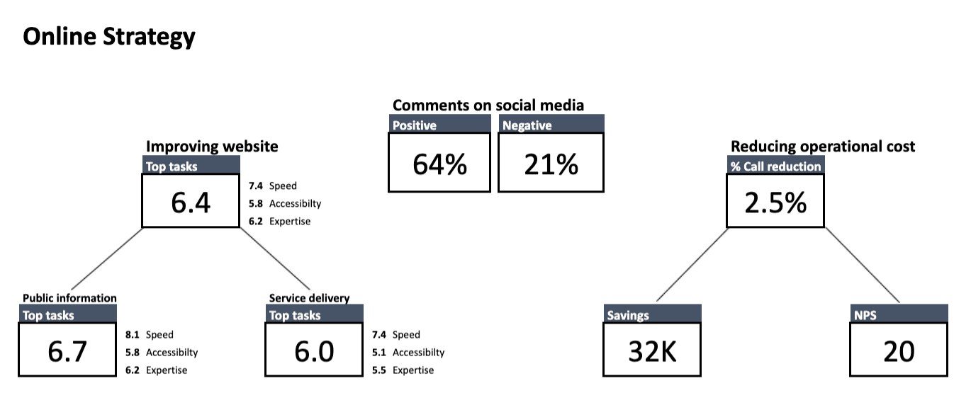
One of the main principles of the framework is that you start looking for what’s potentially wrong from the very top, and then go down into the details. So, the first thing to do is to check if you’re on track with the most high-level goals your organization has set:
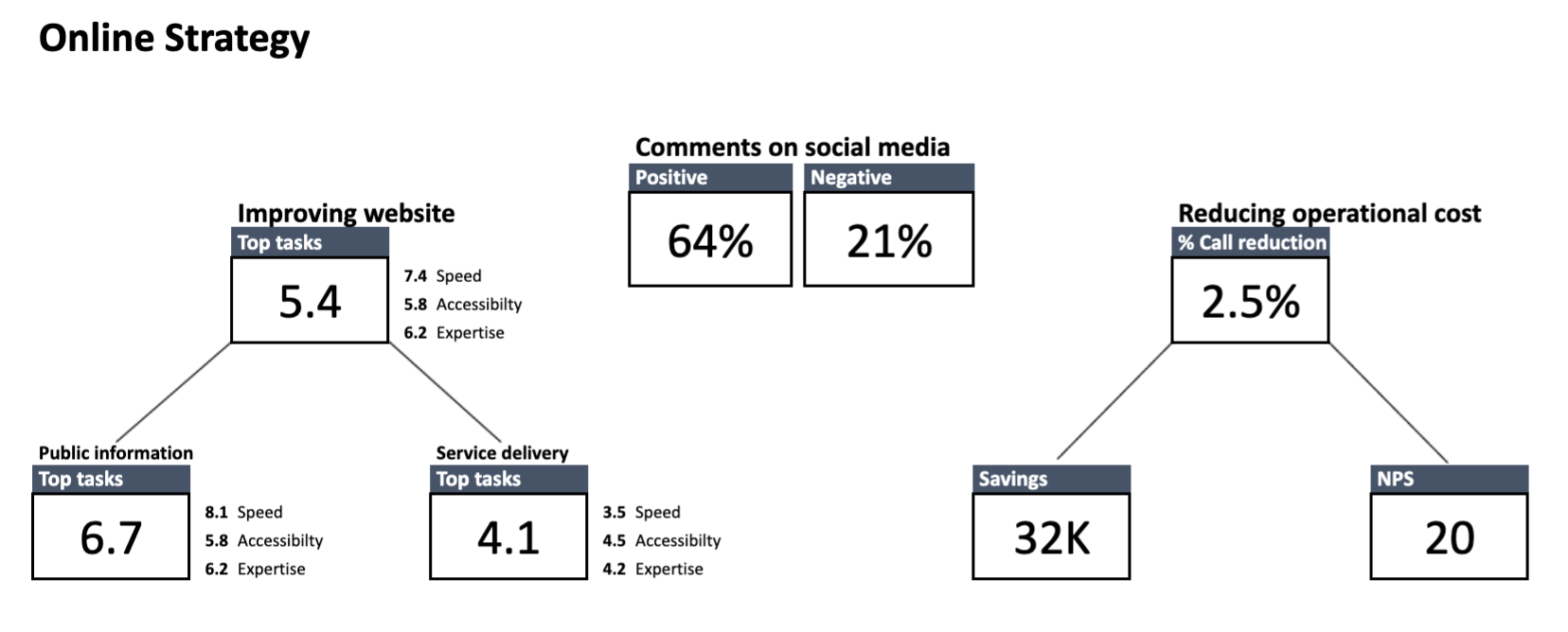
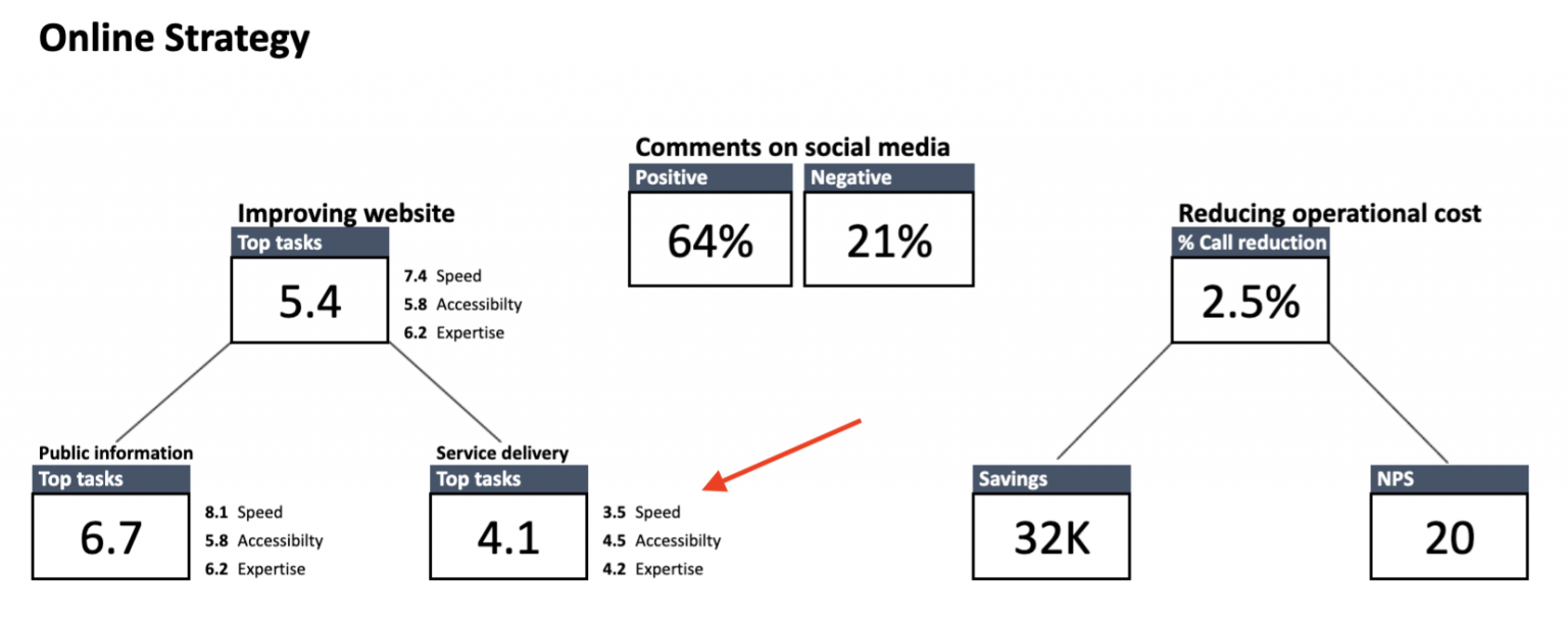
Here’s how to read the dashboard: Starting from the left, you can see the KPIs reflecting your three main strategic goals – speed, accessibility and expertise.
Important note: KPIs from the level of strategic goals are different for each organization, as every institution has its own duties to perform. The dashboards presented in this article are based on the goals chosen for one of Toon’s clients. Because the data of Toon’s clients is confidential, the information presented on the dashboards is anonymized.
The box at the top shows the overall score of all the tasks users performed on your website. Below are the task scores broken down into two groups: public information and service delivery.
To make sure we’re on the same page:
Public information – means finding a relevant piece of information on a website (e.g. an announcement or blog post)
Service delivery – means getting access to services provided by your institution (e.g. applying for an unemployment benefit or renewing a driving license)
Speed – On a scale from 0 to 10, this reflects how quickly citizens are able to find the information or service they’re interested in. It’s calculated by taking into account all the tasks users undertake on the website and the time it takes them to complete those tasks.
Accessibility – On a scale from 0 to 10, this reflects how easy the website is for an average citizen to understand and how easy it is for people with disabilities to access. It can be measured:
- With e.g. Siteimprove, a tool that helps to spot and fix accessibility problems on your website
- With the summed “ease of completion” score from all the tasks (the exact method is presented in the next chapter)
- By creating segments of people with disabilities, e.g. users who turn on the voice menu. Tracking this data allows you to detect and remove any barriers they encounter when navigating through your page
Expertise – On a scale from 0 to 10, reflects how well the content of the website informs citizens. It’s determined by combining the two types of data:
- The answers from the satisfaction surveys placed on the pages related to the most important tasks on your website
- The overall scores of the pages included in the crucial tasks on your website
In the center of the dashboard, you can see a KPI related to comments on social media. In this example, sentiment on social media is also tracked and presented at the strategic KPI level. It’s measured with the use of social media monitoring tools.
Finally, on the right you see KPIs related to reducing operational costs. It could be, for instance, decreasing operational costs by improving access to information and services through online channels. Additionally, you could also track net promoter score (NPS), which tells you how likely citizens are to recommend a service to friends and family.
Strategic level of the FTG framework: How to read the data
Although the strategic dashboard doesn’t solve specific issues, it hints at where to look for solutions.
A good rule of thumb is to focus on the areas in which you score the worst. For example, here you can see that the score for service-related tasks is critically low, at 4.1. It means that citizens are facing some major obstacles when trying to access your services.
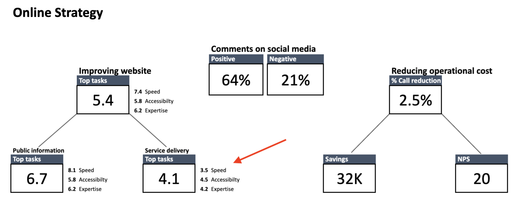
What’s more, you know that the number of phone calls received by the municipal office jumped significantly month-on-month. From talks with the staff answering the phones, you also know that plenty of those calls concerned parking permits.
Now that you have some clues as to what could be causing the trouble, it’s time to dive deeper into the data and test your hypothesis against the statistics from the lower-level dashboards.
Web analytics for governments: How to work with tactical KPIs
The level of tactical goals comprises two dashboards – one concerning stages of the user journey and the other one that concerns the tasks users undertake on your website.
To make sure we’re on the same page:
User journey is the path a citizen takes as they interact with your organization. This journey consists of phases.
Task is a smaller piece of data about user behavior on your website. It describes a set of actions users perform to find specific information or access a service. Every task belongs to a certain user journey phase.

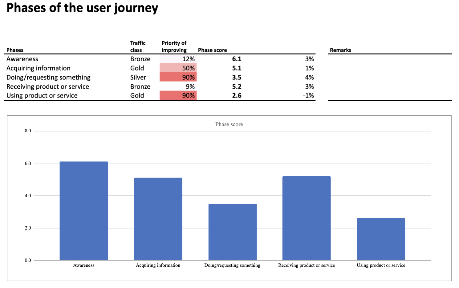
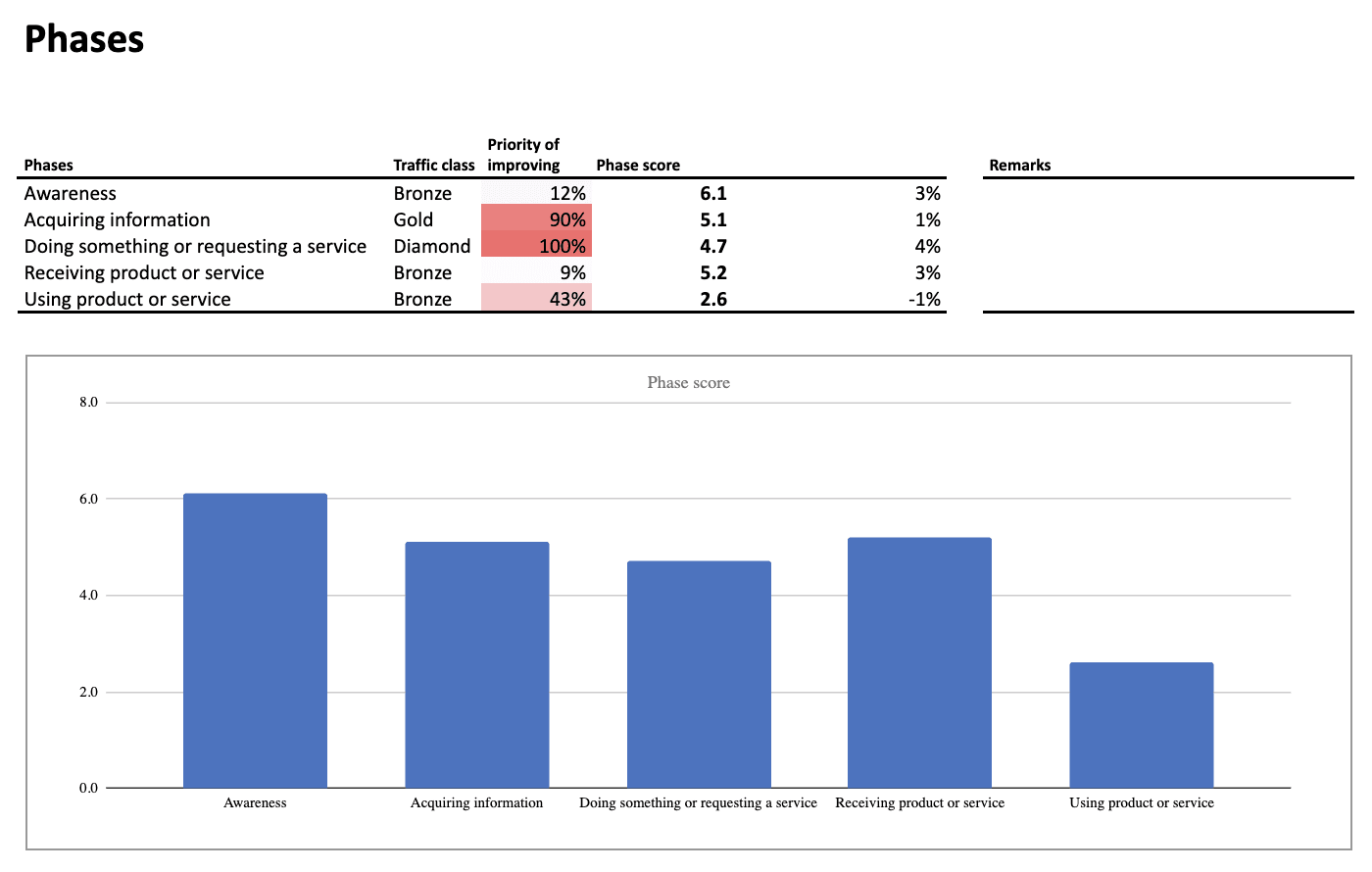
Phases of the user journey can be arranged in many ways and include different user tasks. In this case they’re presented with a modified AIDA model, where:
Awareness – Describes tasks related to informing citizens on certain topics. It’s the phase in which e.g. you announce to citizens that parking permits are now being distributed by the municipal office.
Acquiring information – Describes tasks users perform when they search for content or service they are interested in. It’s the phase in which e.g. users look up the opening hours of the municipal office or check the prices of parking in their neighborhood.
Doing/requesting something – Describes tasks related to requesting a given service. It’s the phase in which e.g. users apply for a parking permit.
Receiving something – Describes tasks that include getting access to a certain service. It’s the phase in which e.g. users receive an email informing that their parking permit is ready to be collected.
Using product or service – Describes tasks related to inquiries about services the user already takes advantage of. It’s the phase in which e.g. users renew their parking permit or exchange their current permit for one valid in a different parking zone.
Performance of the phases is calculated by taking into account:
- Phase score – KPI based on the scores of all tasks from a given phase
- Priority of improving
- Growth – Improvement rate that compares the current score with the score from the previous period
- Traffic class – Popularity of the phase expressed in the class from diamond (most popular) to tin (least popular)
Tactical level of the FTG framework: How to read the data about user journey phases
The dashboard indicates issues at the two steps of the user journey:
- Doing/requesting something
- Using product or service
The underperforming phases have the lowest scores and are marked in red, which makes them impossible to miss.
With this information in hand, you can drill down into the data and look for more clues. You’ll do it by exploring the next type of dashboard, concerning performance of the most important tasks.
Task performance
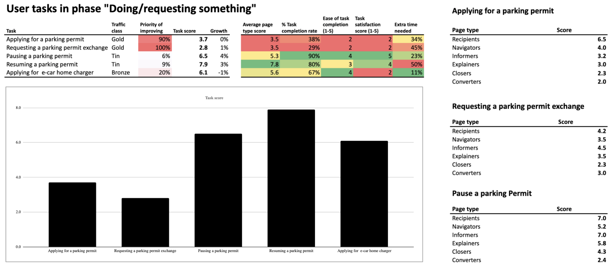
Each of the phases has its dedicated dashboard. Here are the metrics and KPIs that you’ll find on the “Top tasks” dashboard related to the phase “Doing/requesting something”:
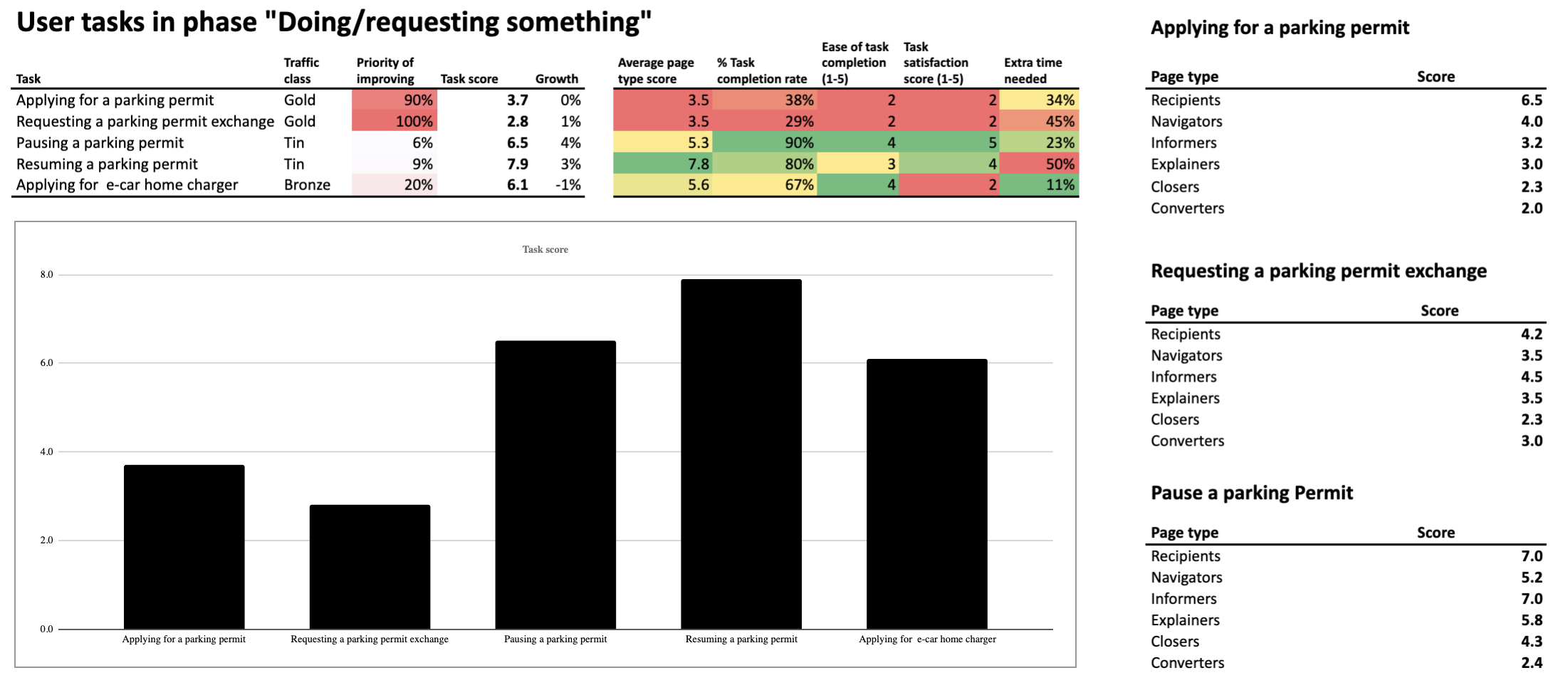
Let’s start with analyzing the metrics placed in the center of the dashboard (the ones highlighted in green, yellow, orange and red):
1) Average page type score – Reflects how well different page types are performing in supporting citizens in their task. It’s measured based on the metrics from the right section of the dashboard.
If you’d like to learn how Toon’s team calculates the score for each page type, be sure to check our next blog post. There, we’ll tackle use cases related to operational goals for your website.
2) Task completion rate – It’s the percentage of people who undertook a given task and completed it. This metric is calculated with the use of funnel reporting, which lets you track visitors’ steps and see the stage at which they drop off. The data is then paired with the results of the user survey in which visitors are asked if they succeeded with finding information or service they need.
Creating surveys is possible by using an external tool or with the content personalization features of Piwik PRO Tag Manager. In both cases, survey data can be integrated with analytics data in Piwik PRO Analytics Suite.
3) Ease of task completion – Indicates how easy it was for a user to perform a given task. This metric is determined by asking a question: “How easy was it for you on a scale from 1 to 5?” (where 5 means the easiest).
4) Task satisfaction rate – A score representing how satisfied citizens are with the way the website supports their task. This rate is calculated based on the answers from a satisfaction survey placed at the bottom of the page, scored from 1 to 5, as in the previous example.
5) Average completion time vs. the fastest possible completion time – The difference between the fastest completion time against the average time in which users complete the task. It’s expressed in percentage points. If the difference is significant, it means that there might be some serious UX issues that prevent users from reaching their goals faster.
In the left section of the dashboard, you see the KPIs – key metrics used to assess your website’s performance on the level of tactical goals. The most important among them is task score (overall score) KPI, calculated based on all the metrics presented above.
The task score is tied to two more KPIs:
– Priority of improving
– Growth
The traffic class metric also helps to determine which tasks require the most attention – the more popular the task, the more important it is to improve its performance.
Tactical level of the FTG framework: How to read the data about top tasks
The breakdown of the tasks allows you to spot issues with:
- Applying for a parking permit
- Requesting a permit exchange for people who have relocated to a different parking zone
Those are the tasks with the biggest rate of metrics marked in red and orange. The numbers say that they’re difficult to complete, leave users unsatisfied with their experience and take longer than expected. Finally, their “Priority of improving” indicates that fixing them is crucial for optimizing your website’s performance.
There is a good chance that these are what’s dragging down your website’s overall statistics.
By exploring the data from the right section of the dashboard, you can spot which webpage types within a given task score the worst. Those are:
Closers – Pages that lead the user into a transactional process, e.g. to the page where they can perform the desired task
Converters – Usually a web form where users can send their applications or complete other tasks
Low scores at the final steps of tasks often indicate issues with web forms. Sometimes the forms are too long. Sometimes the instructions to the forms are difficult to grasp for an average citizen. But it could be something else.
Whatever the problem may be, you’ll uncover it by examining the web forms related to tasks where users apply for parking permits or request a permit exchange. Because now you know exactly where the issues occur.
To make this quest easier, you can also use dashboards from a lower level of the framework. Those are the dashboards that investigate the performance of individual websites and page types. If you’d like to know how to work with this data, read our next article where we’ll tackle the operational goals for public websites.
Conclusion
Improving the performance of public institutions’ websites calls for a comprehensive approach – keeping track of the relevant metrics, applying the necessary changes and then checking if they’ve brought the desired results. That said, working with a web analytics framework designed specifically for public institutions makes the whole process much easier and more efficient.
If you’d like to learn more about the FTG framework, be sure to contact us – we’ll be happy to fill you in on the details. In the meantime, stay tuned for the last article in the series.
The post Web analytics for governments part 2: How to work with strategic & tactical goals appeared first on Piwik PRO.
]]>The post Web analytics for governments: The framework for setting the right KPIs appeared first on Piwik PRO.
]]>What has changed is that now institutions deal with many of these tasks through websites and applications. And to ensure citizens with the best experience in these touchpoints, they require access to meaningful analytics data.
However, making analytics work is more difficult for those in the public sector than it is in the private sector. This happens for many different reasons, including:
1) Lack of internal expertise
Unlike private firms, public sector institutions often can’t afford in-house teams with the technical expertise required to install, implement and maintain the analytics software. Not to mention analyzing the data and drawing relevant conclusions from it.
2) Less defined goals
In a commercial environment, key performance indicators (KPIs) reflect sales targets and customer lifetime value. In contrast, public sector websites are more content- and service-oriented. So KPIs and goals tend to be less straightforward and more difficult to set.
3) Privacy and security constraints
Finally, trusted public organizations should set an example for responsible handling of data, as they process highly sensitive information such as health, tax and court records. Data protection measures need to be airtight, otherwise they risk violating citizens’ privacy rights as well as damaging their own good name.
A solution: The FTG framework
The good news is that there is a way to overcome these issues. The answer to the needs of public institutions is the FTG framework (Functie-Taak-Gedrag in Dutch), created by Toon Vuursteen. Toon is a web analytics advisor and educator for the public sector, working for GBBO, an agency specialized in researching and optimizing online governance service channels.
Years of experience in the field has allowed Toon to come up with a solution that gives the organizations three important analytics assets:
- A new mindset for measuring and optimizing their digital presence
- A ready-made set of KPIs developed with content- and service-oriented websites in mind
- Intuitive dashboards that replace confusing charts and reports, making it easy to spot the areas that require the most attention
Considering the strict privacy and security requirements in the public sphere, Toon turned to Piwik PRO Analytics Suite to put his ideas into practice.
Our new series of blog posts will describe the ins and outs of the FTG framework. In this article, we will focus on explaining the key notions of the methodology. The next ones will present practical use cases for measuring the effectiveness of the public institution websites.
Let’s get started.
Anonymized data – Because the data collected by Toon’s clients is strictly confidential – all the data shown on the dashboards in this blog series is anonymized.
Setting up KPIs for government websites with the FTG framework
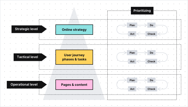
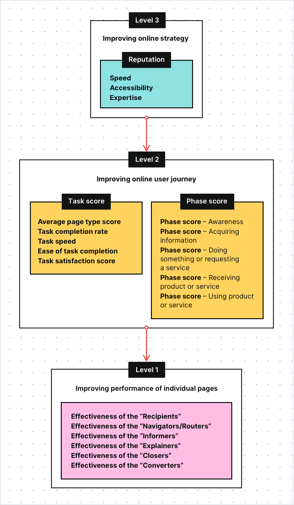
The most important concept of the FTG model is that it breaks the KPIs into smaller groups, so they are easier to track and understand:
- Level 3: Shows you how well you’re performing in terms of your strategic goals
- Level 2: Shows you if the digital user journey on your website is pleasant and easy
- Level 1: Shows you if the individual pages of your website do their job well
To make sure we’re on the same page – key performance indicators (KPIs), sometimes called key success indicators, are metrics organizations track in order to check their performance against the goals. It’s your KPIs that hold the key to improving performance of your website.
The KPIs at Levels 1 and Level 2 are typically the same for each organization. More differences occur at Level 3, as every institution has its own duties to perform.
If you’re interested in how this hierarchy might look like, here you can find a sample KPI set for one of Toon’s clients, the Dutch court system – Rechtspraak:
Now, let’s discuss in detail what you can see on this graph, starting from the very top.
Level 3: Strategic KPIs for the public sector
These are the most high-level objectives for a website – the ones that define your online strategy. For many public institutions, those KPIs will be related to their reputation and therefore to citizens’ satisfaction.
Here you can find a sample dashboard with the strategic KPIs of the Rechtspraak:
As you can see, one of the important strategic KPIs is the top task score, under the heading Improving website, with three sub-KPIs:
- Accessibility – Reflects how easy the website is to understand for an average citizen and how accessible it is for people with disabilities. The KPI is measured with the use of tools such as Siteimprove.
- Speed – Reflects how quickly citizens are able to find the information or service they’re interested in. It’s calculated by taking into account all the tasks users undertake on the website and the time it takes them to complete those tasks.
- Expertise – Reflects how well the content of the website informs citizens. It’s determined by the answers to the satisfaction survey placed at the bottom of content pages. The survey contains the following questions: Q1: Was this page useful? Q2: Was this page understandable?
In this case, sub-KPIs are tracked separately for two types of tasks people can perform on the office’s website:
- Public information – finding a relevant piece of information on a website
- Public service delivery
Sometimes, as in the example above, strategic goals are related to finances. It could be, for instance, that decreasing operational costs is the result of improving the access to the information and services through online channels.
Additionally, tracking net promoter score (NPS) will tell you how likely citizens are to recommend a service to friends and family.
In this example, sentiment on social media is also measured and presented at the strategic KPI level. This is because the client’s reputation is mission-critical.
Other strategic KPIs tracked by Toon’s clients include:
Findability – the percentage of users that have entered the content page via search engine. It also takes into account how many users have found the page via the internal search of the website.
Ease of use – calculated based on the Customer Effort Score question: How easy was it to perform the task you just did? (On a scale of 1 to 5: 1 being very difficult and 5 being very easy).
Level 2: Tactical KPIs for the public sector
Now that you know what strategic KPIs you want to track (e.g., speed or accessibility), you need metrics that will allow you to follow your progress. The way to do this is to analyze the complete journey of the users.
There are many kinds of information that citizens search for on your site and equally as many kinds of services they want to receive.
Depending on the sector you operate in, citizens may want to look up the text of a new law, check their constituency, file for unemployment or report a missing ID card. To do so, they need to enter your website and click through individual pages to find what they came for.

In the FTG framework, this set of actions is called a task. Whatever it might be, your role is to make sure that the whole process will be as smooth, pleasant and efficient as possible.
This way, you not only improve your results at the strategic KPI level, but also enhance the user experience of people visiting a website.
Metrics that help with tracking task performance are:
- Average page type score – indicates how well different page types are performing in supporting the citizen in their digital user task
- Task completion rate – the percent of people who undertook a given task and have completed it
- Task speed – the average time in which they’ve completed a given task
- Ease of task completion – the minimization of difficulties on the way to completing a task (e.g. unattractive or incomprehensible copy, overly long webforms, technical issues for certain browsers)
- Task satisfaction score – a score representing how satisfied citizens are with the way the website supports their task
Toon pinpoints underperforming tasks with the task score (overall score) KPI. The task score is accompanied by two more KPIs, being: Priority of improving and Growth.
Below is an example of the KPIs for a Dutch municipality.
The second column (Traffic class) in the table shows the popularity of a given task expressed in the class:
- Diamond (most popular)
- Gold
- Silver
- Bronze
- Tin (least popular)
The priority of improving (third column) steers your effort towards optimizing the tasks that need the most attention. Vivid colors, red and orange, make them impossible to miss.
The examples above are demonstrated on Toon’s original dashboards. However, the data can also be presented in different ways, e.g. using Piwik PRO’s custom reports or external BI tools.
Tasks, in turn, can be grouped into categories that refer to phases of the user journey. They can be arranged in various ways, for example, with the use of a modified AIDA model:
- Awareness
- Acquiring information
- Doing something or requesting a service
- Receiving a product or service
- Using a product or service
This makes it possible to measure and optimize complete phases of the user journey instead of just optimizing tasks.
User journey is the path a citizen takes as they interact with a given organization.
Single digital gateway integration (SDG) for government organizations
Single digital gateway integration (SDG) for government organizations
Transfer all the necessary information to the single digital getaway automatically to easily comply with EU regulations. Use the integration to send the Piwik PRO monthly report to SDG. The report includes information on page views by country and device for each URL. The integration is available upon request to all our users. Read more on SDG integration.
Level 1: Operational KPIs for the public sector
Finally, there are KPIs at the most granular level – the effectiveness of individual pages that are the building blocks for the entire user journey. According to Toon’s model, pages on public service websites can be divided into the following categories:
- Recipients – The general homepage and “homepages” of certain parts of the website – e.g. specific services or departments.
- Navigators/Routers – Pages with extensive menus linking to different parts of the website, as we see here:
- Informers – Content pages that present information, e.g. articles or public announcements
- Explainers – Task-oriented content that explains specific processes and procedures, e.g. applying for a benefit or filing a lawsuit
- Closers – Pages that lead the user into a transactional process, e.g. to the page where they can perform the desired task
- Converters – The last step in the transaction process, usually a web form, where users can place their applications or complete other tasks
This distinction is not fixed, as different pages may play several roles at once. However, using these categories allows you to understand what function a given page has in the user journey. It also lets you assign an appropriate set of metrics and KPIs to assess their effectiveness.
Depending on the type of page, you can measure your progress at the page-level using metrics such as (though not limited to):
- Page views – how many times a page has been viewed over a given time period
- Click-through rate – the proportion of users who followed a link to a particular site
- “Oops” rate – how often users went back and forth on the page in search of information (such behavior usually indicates that they weren’t able to find what they were looking for)
- Menu rate – how often users looked for information in the top menu of the page (this kind of behavior is undesired when the information should be easy to find in the body of the page)
- Search rate – how often visitors used search (the behavior is not always undesired, but often indicates that the page is not presenting what the user expected)
- Bounce rate / exit rate – how many users arrived at the page and ended its visit there
- Scroll depth – how far the user came down the page when browsing it
- Visits from SEO – how many people have entered the site through the search results
- Visits from social media – how many people have entered the site through social media channels
The collection of metrics will vary depending on the site’s category. For example, while for the “Informers” traffic sources, time on page and scroll depth play a significant role, on the “Navigators/Routers”, the “oops” rate and search rate will be way more important.
Based on chosen metrics, Toon calculates the same KPIs as for top tasks, such as:
- Priority of improving – how important it is to optimize a given page
- The overall score – how well this page is doing compared to other pages
- Growth – the progress of a given page over a certain period of time
Here you can find a sample dashboard for tracking the effectiveness of the “Recipients” (The homepage or the “homepages” of different parts of the website):
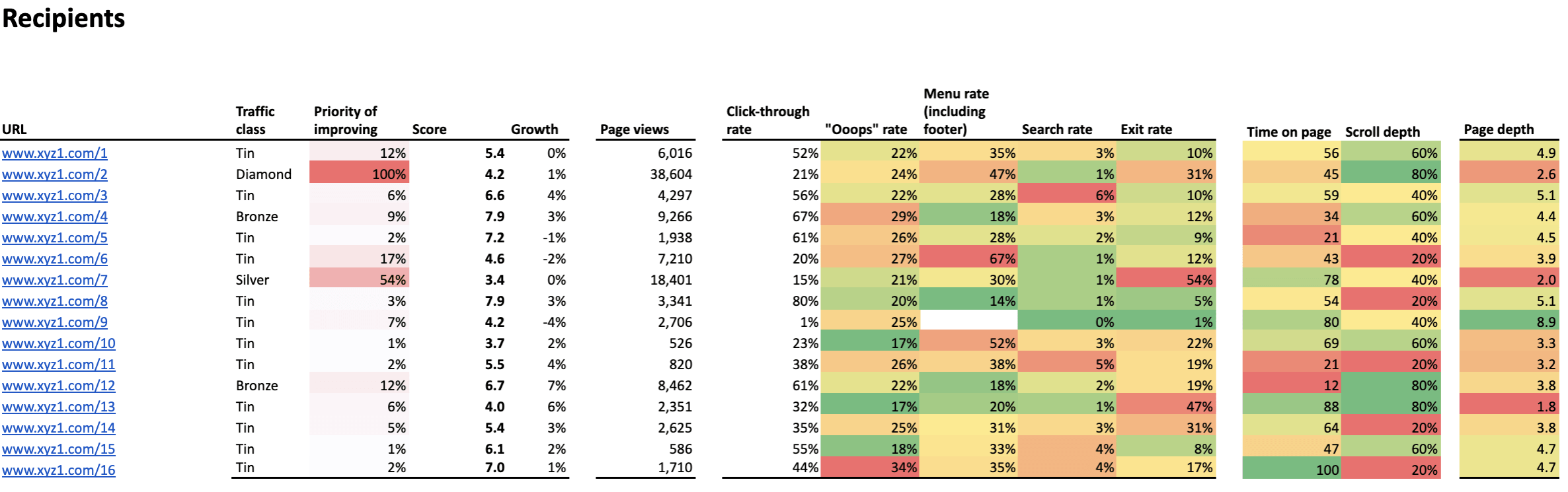
Again, cells marked in red and orange show the areas that require your attention, while the column named “Priority” helps you define which websites should be taken care of first.
Final thoughts
With all the KPIs and metrics set and all the dashboards arranged, you can analyze and optimize your organization’s website with data-driven methods for:
- The whole user journey
- Particular phases of the user journey
- The most important tasks users undertake on your websites
- The types of the pages
- The individual pages and content
Such detailed overview will allow you to:
- Locate pain points and prioritize where changes are most needed
- Make continuous improvement by analyzing data and running A/B testing

Read the parts two and three of the series:
Read the parts two and three of the series:
What’s also important is that after dedicated training, public servants will be able to use the dashboard and interpret data entirely on their own.
We hope that with this blog post we were able to shed some light on the principles and the biggest advantages of the FTG framework. At the same time, we’re aware that there are still many areas that need further explanation.
But don’t worry, we’ll cover them in future blog posts as part of our series. There we’ll show use cases of improving your efforts on the strategic, tactical and operational level. Stay tuned!
The post Web analytics for governments: The framework for setting the right KPIs appeared first on Piwik PRO.
]]>The post Web Analytics for Government and the Public Sector: 5 Arguments to Consider appeared first on Piwik PRO.
]]>Hopefully this is a rhetorical question. However, if it’s not, then it’s high time to find a convenient and safe way there. You can expect some bumps in the road, whether in the form of technical constraints or the challenges of the GDPR looming on the horizon. Never fear! We’ll take this load off your shoulders by serving as your tour guides for the journey.
The top priority for government and public sector institutions is to provide high-level services. They have the same goal as any other profit organization. The expansion of their presence beyond physical locations significantly changes they way they operate. Being part of a digital ecosystem entails certain challenges.
The key to making the system thrive is to measure, analyze, and report on how all its elements work. Here’s where web analytics solutions come into play. Such software tools provide government institutions and public sector organizations with detailed insights allowing them to discover every possibility for improvement.
Organizations of public trust are in the spotlight. Clearly, they should set an example for responsible handling of data. This is particularly true when we consider that they process highly sensitive data like health, tax, juridical records, and so on. Safety measures need to be airtight and backed by double the usual vigilance.
We know that a safe web analytics strategy is a must for any organization with a digital presence. Institutions in the public eye require a specific approach. In this post we analyze some serious issues of particular importance for government agencies.
1. Privacy and GDPR
Respecting citizens’ privacy is critical for government agencies. The rise of new technologies has significantly increased the privacy risk landscape.
As noted by John Edwards, Privacy Commissioner of New Zealand, “there are bigger risks that have come with having bigger data holdings. More can go wrong, more spectacularly, more quickly than was the case under paper-based systems”.
He also states that the issues of data security and privacy are becoming a top business-technology priority, and that both the private and public sectors face the same expectations in this regard.
GDPR – the General Data Protection Regulation – hammers this point home. It’s included in the body of the law under the principle of privacy by design.
The notion itself was introduced back in the 1990s by Dr. Ann Cavoukian, Information and Privacy Commissioner of Ontario. Essentially, it holds that compliance with legislation and legal frameworks can’t be the only assurance of privacy. It should be guaranteed by the way organizations operate.
The concept of ‘privacy by design’ adopts proactive measures rather than reactive ones. This approach is stressed in Article 35 GDPR, which states:
Where a type of processing in particular using new technologies, and taking into account the nature, scope, context and purposes of the processing, is likely to result in a high risk to the rights and freedoms of natural persons, the controller shall, prior to the processing, carry out an assessment of the impact of the envisaged processing operations on protecting personal data. A single assessment may address a set of similar processing operations that present similar high risks.
Furthermore, privacy impact assessments (PIAs) lie at the core of the privacy by design approach. These help organizations discover and solve problems at a projects early stages. Such measures should lower or even eliminate the costs and reputation damage that could result from a breach of data protection laws.
The comparison of 10 web and app analytics platforms
Learn the key differences between Piwik PRO Enterprise, Google Analytics 4, Matomo Cloud, Adobe Analytics, AT Internet, Countly Enterprise, Mixpanel Enterprise, Amplitude Enterprise, Snowplow Enterprise, and Heap Premier.
That’s about it when it comes to a theoretical perspective on data privacy. But what about practical considerations? In other words, what do government organizations need to have in order to handle data safely.
Organizations in the public sector need a reliable and verified tool. Beside the basic capabilities of web analytics for governments that help them optimize their websites, the right software should feature:
- automatic anonymization of visitor IP address
- data retention
- web analytics opt-out feature on your site
- Do Not Track setting
- visitors consent collection
Under the GDPR you will need users permission in the form of consent to process their data. However, users might change their mind and wish to withdraw that consent. So you need to manage these requests. Imagine dealing with millions of such tasks! Thankfully, theres a convenient way to do it by using a Consent Manager. This feature will be available shortly, so follow our blog to keep up-to-date on the news.
Privacy simply cant be discussed without reference to GDPR. This legislation is generating a lot of confusion among companies and organizations that process data. Its one of those rough patches we mentioned earlier.
However, reports reveal that some public sector bodies think theyre exempt from the Regulation. Such a belief is based on the laws special conditions and derogations that allow EU Member States to limit the reach of GDPR in defense of the public interest.
That said, the fact is that GDPR applies to all institutions that process the personal data of European Union residents, regardless of their size or sector they operate in.
The aim of this legislation is to tighten up the rules of collecting, storing, and handling data. Its been created to protect all EU citizens from privacy and data breaches. The cornerstone of the GDPR is the human right of privacy.
As we can see below, the path to GDPR compliance is a complex one centered around ethical principles of handling personal data.

So in the face of a growing number of security breaches, stricter data protection regulations are simply the natural order of things. The most common violations of data security include:
- hackers and ransomware launchers
- accidental loss
- exposure of data (caused by improper destruction of records).
As reported by Gemalto, a leading global provider of digital security solutions, the first half of 2017 witnessed 918 data breaches worldwide. A whopping 89 of them affected the public sector.
The new EU data protection rules certainly impose stringent requirements and restrictions on web tracking. Thus, governments and public sector organizations handling data need the right tools to ensure compliance with GDPR. If you want to get the bigger picture, have a look at how Piwik PRO addresses the matter of GDPR compliance for governments.
2. Control over data
There’s mounting public concern about potential digital threats. Governments must go to great lengths to protect their citizens privacy. Part of this is avoiding any exposure of personal data to global corporations.
Lets make it clear with a concrete example. Consider the possible risk involved with using Google Analytics, which is employed by around 60% of all websites. GA tracks user activities. It allows Google to know what visitors went to a particular website and when they were there.
By applying a range of services like AdSense, it builds very precise profiles of both websites and their visitors. Google gathers quite detailed data and information on its users. This data is further used to create custom audiences and targeted ads displayed via AdWords.
Government agencies should stay on the safe side and avoid such practices. They can, for instance, choose an analytics vendor that allows them to host their web analytics software and track data inside their own dedicated infrastructure. This is precisely what Piwik PRO offers. Government bodies can gather, store, and analyze data in one place without sending it to a third party. Full control of data is a prerequisite to compliance with privacy regulations.
3. Professional support
Governments around the world use web analytics on a daily basis. But without support and expertise they can’t unlock its full potential. This has been demonstrated by GIS (Geographic Information Systems) in New Zealand, who conducted a survey to see how the public sector handles web analytics capabilities.
It turned out that 81% of respondents expressed the need for more analytics support, tools, and up-skilling.
This is just one of many examples, but were aware that guidance is always welcome if you want to get the best results for your efforts. Its crucial to choose a web analytics vendor who provides you not only with professional onboarding but also stays by your side, giving expert advice along the way.
Government organizations need reliable and qualified support to better perform their duties in serving the public. Some vendors, like Piwik PRO, are there to help not only with deployment, but also assist with set-up and give guidance whenever you run into problems. Public sector institutions can feel at ease and dont need to keep a team of IT experts on the payroll. To learn exactly what this support looks like in practice, read our post on self-hosted analytics.
Remember, however, that support is not only about technical constraints. Government agencies should seek a web analytics vendor that advises on best practices to get the most out of their tools. Their advice should also involve recommendations on:
- defining business goals and measurement structure
- help with reading and interpreting reports and data
- tips on using features that bring the most value
4. Ease of integration
When it comes to the web analytics tool itself, it must be flexible and easy to modify. The expectations of government bodies are no exception, as they need something adjustable to their unique needs and requirements.
When choosing a solution for web analytics for governments and public institutions, look for tools that can be enhanced with numerous plugins and smoothly integrated with software already in use by government agencies. When it comes to Piwik PRO, you can take advantage of integration with external tools like:
- SAML – Security Assertion Markup Language
- LDAP – The Lightweight Directory Access Protocol (coming soon)
- Active Directory (coming soon)
As every organization has its own unique requirements and expectations, its vital to find the right tool and strategy that suits its business needs. Look at our integration section to learn more about features and modules that might come in handy for your data handling.
5. Scaling to handle high traffic
As a significant point of contact for citizens, government agencies websites need to handle large volumes of traffic day after day. Of course, high numbers of visitors to a government webpage are always welcome.
However, it may be quite taxing on resources, calling for more advanced infrastructure that will scale to handle such heavy traffic. Thats why government agencies require web analytics tools that offer these capabilities. For example, Piwik PRO has made a priority of major performance improvements. It can now easily scale to millions of pageviews per month and to thousands of registered websites at once. Moreover, product updates bring more functionalities and further advancements. This ensures enterprise-level services that scale the platform to even higher traffic volumes.
The comparison of 10 web and app analytics platforms
Learn the key differences between Piwik PRO Enterprise, Google Analytics 4, Matomo Cloud, Adobe Analytics, AT Internet, Countly Enterprise, Mixpanel Enterprise, Amplitude Enterprise, Snowplow Enterprise, and Heap Premier.
Final thoughts
Efficient and reliable web analytics for governments is no holy grail. Its just a matter of defining goals and establishing a business strategy. Then you have to find a suitable vendor. This is a partner that understands and addresses the specific concerns linked to organizations serving the public. We hope that this post has helped make the decision process a bit easier. If you want to know more about finding the right software to meet the needs of public institutions, reach out to us.
The post Web Analytics for Government and the Public Sector: 5 Arguments to Consider appeared first on Piwik PRO.
]]>The post How to Choose the Right Web Analytics for a Governmental Organization appeared first on Piwik PRO.
]]>In this article, we’ll help guide those working in governments through the process of choosing the right web analytics solution that meets their needs.
But first, let’s recap the main benefits of having a web analytics solution.
Why web analytics?
On a practical note, the right web analytics solution will help governments optimize the websites and hence make a better use of the resources they’ve already invested in. It will help detect and eliminate possible bottlenecks on the paths to conversion, learn what browsers and device types the visitors use to access the services. Such information is a prerequisite for any marketing and communication planning – it helps structure the communication strategy and prioritize when working on a budget.
Last, but not least, it helps governments improve the service experience and build an image of trusted organizations.
So now that we’ve covered why data analytics for government is important, let’s take a look at some key areas that you should look for in an analytics solution and why these areas are important.

The hosting method: On-Premises vs. Cloud
Governmental organizations by nature often access and process highly sensitive, personal data the collection of which is governed by rigid policies and procedures. Some of them may dictate the choice of mode of hosting. If your internal policies enforce hosting any IT solution on your own infrastructure – the choice is relatively simple.
If it’s not the case, you may feel inclined to invest in cloud solutions, which tend to be more cost-effective and more easily scalable. The main factor determining your organization’s cloud web analytics should be security and compliance with the legislation applicable to you.
Choosing the right web analytics for governments, go for one hosted on secure servers in locations governed by strict privacy regulations. For example, Piwik PRO’s hosting options include on-premises in your own cloud account with one of our certified cloud providers, private cloud in a dedicated database or dedicated hardware, and cloud-hosted models (with servers in Germany, France, Sweden, Hong Kong, the Netherlands, and the United States), depending on your requirements. This way, you’re able to store data under rigid EU and US privacy laws.
For more information concerning the relationship between hosting models and liabilities, click here.
Evaluate Your Web Analytics Solution Towards GDPR In 12 Steps
Find out if your analytics solution guarantees data accuracy and privacy, including GDPR compliance:
Absolute control of data
Having an analytics solution that provides full data ownership is important for governments, if they want to mitigate the risks stemming from liabilities. Only when being in control of your user data, you can be assured no third party will use your user data in a way that breaks your visitor’s trust.
On top of complete data ownership, governments could look for tools with enhanced security functionalities. These could be functionalities empowering the tool’s administrator to assign selectively the access to particular pages, or those that allow integrations with SSO (Single Sign-On) mechanisms, giving the administrators tightened control of the access to the tool itself.
As you must now, the European Union is currently polishing up General Data Protection Regulation (GDPR), set to come into effect in May next year. The Regulation takes a more rigid stance on transparency. The Article 12 of the document obliges data collectors to be ready to provide, in a legible way and in plain language, the information concerning what data is processed and for what purpose.
Only by not sharing the data with third parties, or by making sure no data leaks have taken place, you will be able to communicate such information to your users in a responsible and truthful way. Mind you, even though the GDPR is an EU legislation, it’s applicable to all organizations, regardless of their location, that handle data of EU citizens.
Open-source
The necessity to collect data in a transparent manner stems not only from EU regulations, it’s also every government’s obligation if they wish to instigate trust among the citizens they serve. That’s why some governmental organizations choose open-source solutions – the source code of such solutions is available to general public, so virtually everyone having the necessary skills and knowledge is able to verify what kind of information the code collects.
Variety of tracking methods
Some institutions have internal regulations prohibiting JavaScript tracking. If you’re one of them, what you could do is find a web analytics vendor that offers Log Analytics tracking. This method allows discrete tracking as it doesn’t alter the code of your website. The downside is that it gives you only limited information on your users.
Other organizations that use JavaScript tracking method but would rather not leave cookies within the visitors’ browsers can tap into fingerprinting technology to recognize returning visitors. Fingerprinting lets markets and data analysts identify users by combining different variables, such as: the IP address, type of browser, the time zone, fonts, an operational system, and installed plugins.
This technology has its downsides too, however – it’ll fail in the case of tracking corporate visitors who most often share the same IP address and so will be recognized as a single visitor. Still, it’s a robust tracking method as marketers don’t lose track of a visitor even when he or she erases cookies. It’s also popular with governmental organizations that want to be privacy friendly.
Handling large volumes of data
Governments often process the data coming from a complex web ecosystem. They need a sound, high availability solution which would cope not only with the anticipated load of visits, but also would endure sudden spikes of traffic. Any system failures as a result of data overload would normally lead to skewed, incomplete data which is, it’s fair to say, useless.
If your organization possesses a complex website, with multiple pages, what you need is either an on-premise solution set on high capacity servers, or a cloud solution that you’d be able to scale, if needed.
Support and maintenance
Speaking of high availability and the importance of processing complete data, we need to mention SLA and the support you should be given by your web analytics solution vendor. Go for a vendor who, on top of offering satisfactory SLA terms, offers you round the clock maintenance and support.
Piwik PRO goes as far as to assign you an expert who is dedicated to your project and so familiar with your needs. He or she will not only be in charge of reacting to potential problems, but will stay in touch with you and make sure you make the most of the tool.
Integration with third-party solutions
Reducing red tape may sound like a joke when it comes to institutions full of procedures.
Having said that, there are solutions designed to make your life a little easier by streamlining reporting activities. Look for a web analytics tool which can be seamlessly integrated with the third party solutions you use and facilitate the data flow, which lets you import the data from your other tools and include them in the web analytics reports you may schedule to send at a chosen email address in selected time intervals.
Let’s recap
Summing up, as a governmental organization you need a secure, privacy-friendly web analytics tool that would help you not only streamline the processes for your stakeholders, but also will support you in establishing reputation of a trustworthy organization. When choosing the right solution, pay attention to hosting method, security of your data – you want to have a complete control of your user data and exclusive rights to it. Open-source solutions will help you project an image of a transparent organization, while fingerprinting technology will let you identify returning visitors without the need to use cookies. When making the decisions, have also in mind the volume of traffic your web analytics solution will need to handle, and consider a vendor that will support you in installing the platform and will take care of its maintenance.
If you feel inclined to know more about how Piwik PRO Web Analytics can aid governments fulfill their mission, do not hesitate to contact us. Stay also tuned for more insight into web analytics’ world.
Evaluate Your Web Analytics Solution Towards GDPR In 12 Steps
Find out if your analytics solution guarantees data accuracy and privacy, including GDPR compliance:
The post How to Choose the Right Web Analytics for a Governmental Organization appeared first on Piwik PRO.
]]>